Concept Project
Client: Meetup
Tools
Figma, Concepts, Zoom, Google From
Timeline
2 weeks
Team
Mathew Hodgkin, Grace Pollok, Kate Wziatek, Tom Chappin
My Role
Researcher, UX/UI Designer
Skills
Interview, Competitive and Comparative Analysis, Personas, Project Plan, Wireframes

Concept problem: Meetup wants to convert passive users - who sign up for events but end up not attending - into active users who do attend the events that they have signed up for.
Concept project overview:
Meetup is a service used to organise online groups that host in-person and virtual events for people with similar interests.
Meetup now wants to convert passive users — who sign up for events but end up not attending — into active users — who do attend the events that they have signed up for.
They plan on building a new feature that will help and encourage passive users to get over their fears and anxieties about meeting new people in real life.
White Paper Research:
For those with social anxiety, life after lockdown can be a scary prospect…
To understand how social anxiety can make everyday life extremely difficult, I decided to draw some information by researching the topic.
Interviews:
4
in-depth.
We asked participants 7 questions on our screener surveys, ranging from. — Have you ever used meetup? Do you ever experience anxiety when attending an event in person? — Based on our findings, we selected 4 participants for an in-depth interview.
The team started with two assumptions that could help reduce anxiety before an event.
- Newcomers may enjoy short introductions at the start of the event.
- Connection with other attendees before the event.
The first assumption was somehow correct, though most people get nervous when they need to introduce themselves in public. The size of the event is a key influencing factor in their anxieties.
As expected, everyone mentioned they will feel more comfortable knowing someone before the event. Having someone that you can rely on makes a huge effect on your anxiety level, even if you recently meet the person.
Below are some of the questions asked in the interview phase.
- What type of events/groups do you attend/are you interested in?
- What worries, if any do you have before attending a new event?
- Have you ever signed up for an event and not attended? Can you describe this experience?
- What would help you with the feeling of anxiety?
- If you knew somebody else that was going to the event, would you be more likely to attend?
- Would you be interested in connecting with somebody before the event? Is there anything, in particular, you’d like to know about them before connecting?
- What would reassure you that you will have a positive experience at the event?
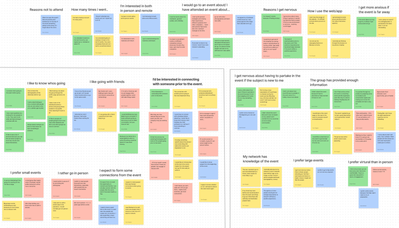
Affinity Map:
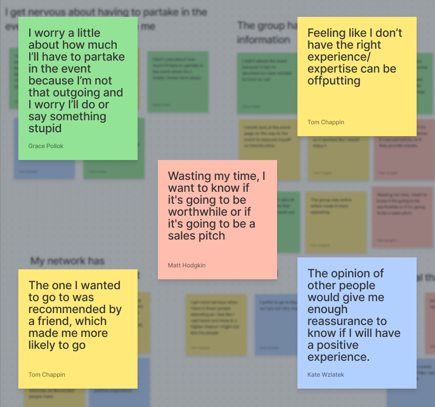
Analysing the data collected from the interviews, we spotted some common patterns and identified two main scenarios which would help to reduce anxiety for attendees.
This group cared most about connecting with someone prior to an event.
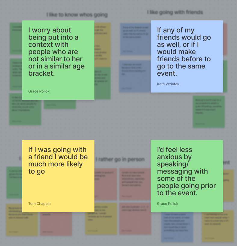
This group would appreciate more information about the event.
Main:
Personas:
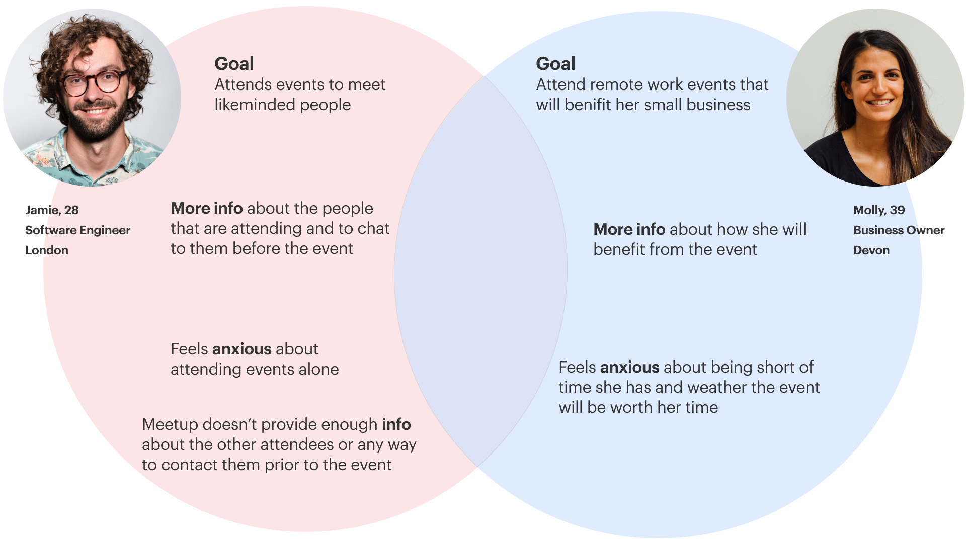
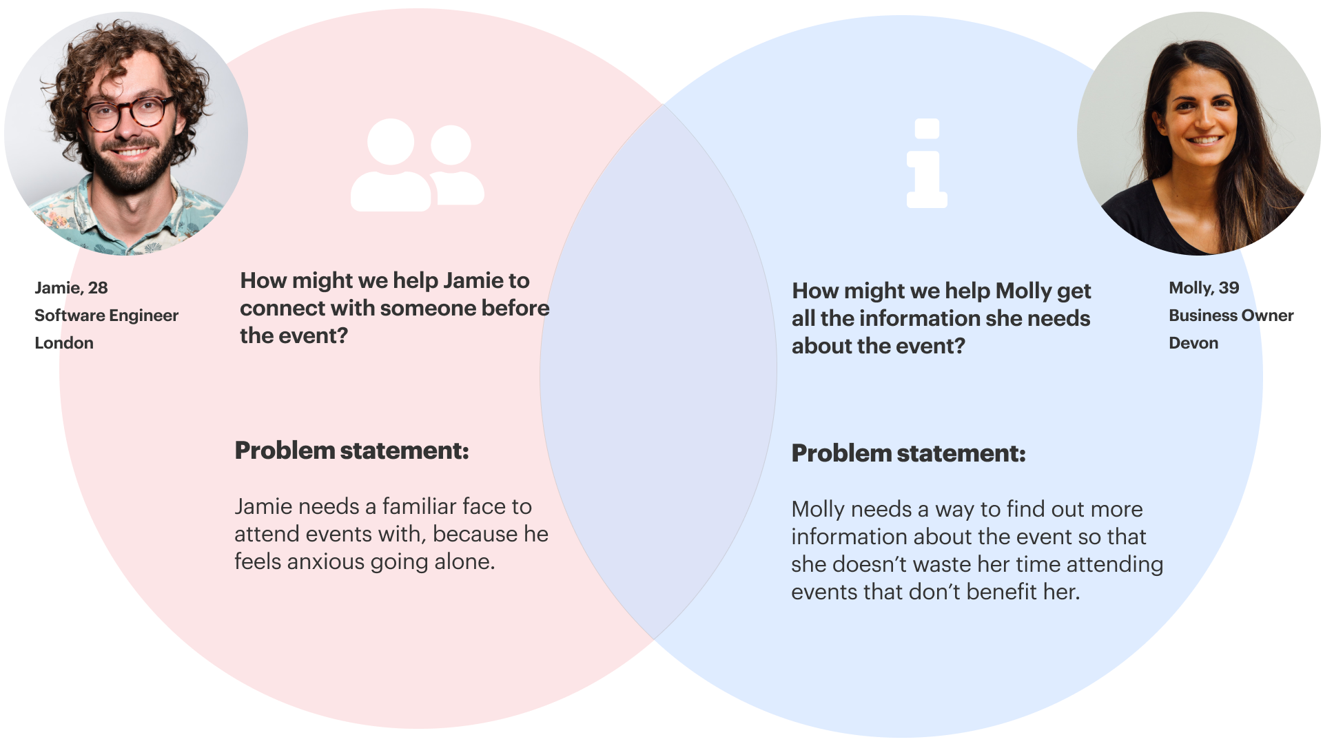
Jaime
Jamie is a 28-year-old software engineer. He’s new to London and works from home, so doesn’t have a lot of opportunities to meet new people.
He’s on Meetup to find like-minded people to hang out with and he prefers going to events in person, but often finds himself too anxious nearer the time.


Molly
Molly is a 39-year-old small business owner, living in Devon. She’s on Meetup to learn new skills to help her grow her business. As a mother of 2, she’s very busy, so prefers attending online events; she books well in advance but often finds herself cancelling nearer the time as she gets anxious about whether it will be worthwhile.
Problem Statement & HMW:
During the interview process, we learned that events that are not structured or do not communicate well about what’s going to happen can create anxiety. To address this issue, a second persona was created.
Though this is not our main problem, we believe that this can be easily solved, by providing more information on the event page. With that in mind, we still wanted to focus on Jamie’s problem first, but also keep in mind that with some small changes, we could also reduce anxiety regarding the lack of information provided on the events page.
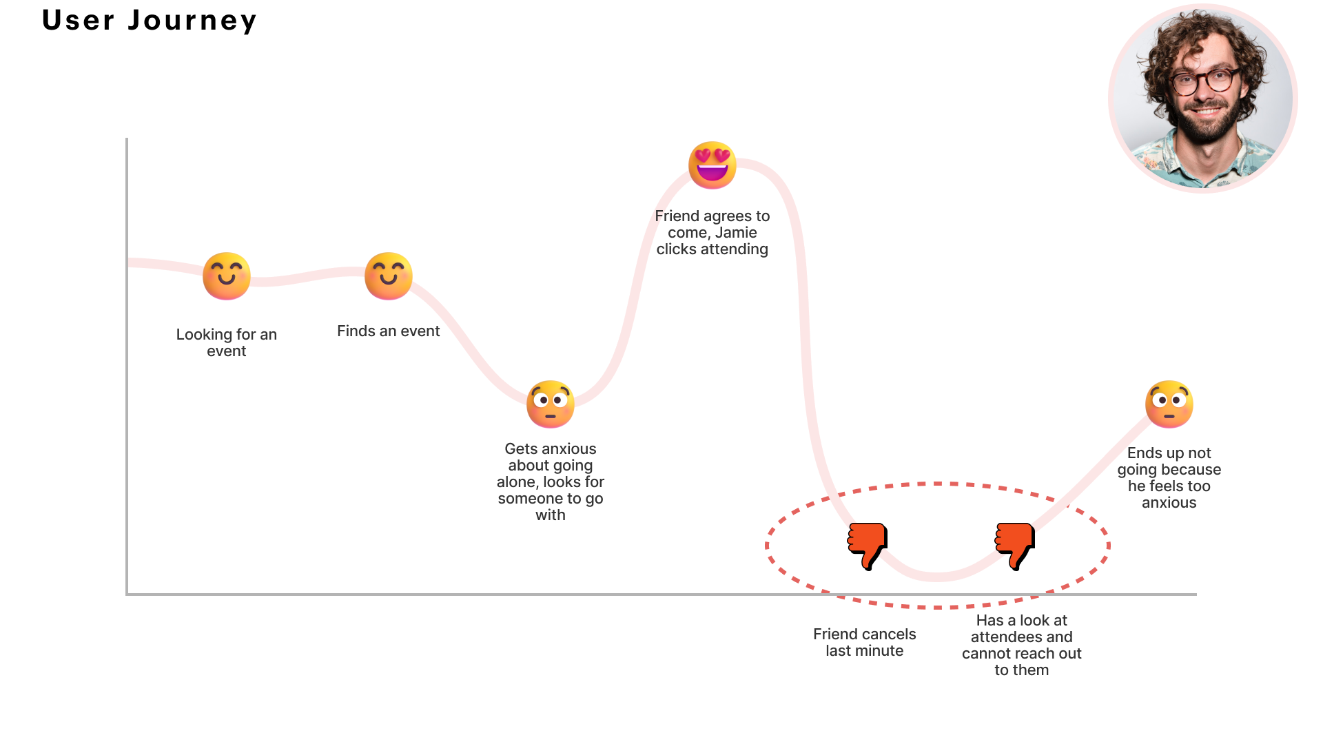
User Journey:
On Jamie’s journey, we notice that finding a friend to go with him to an event can be problematic, most of the time, the friend’s reason to go to the event is related to the person, and not a direct interest in the event itself. With that in mind, the team started considering different ways of allowing people to find other participants that are already committed to the event and then trying to find ways to match these people.
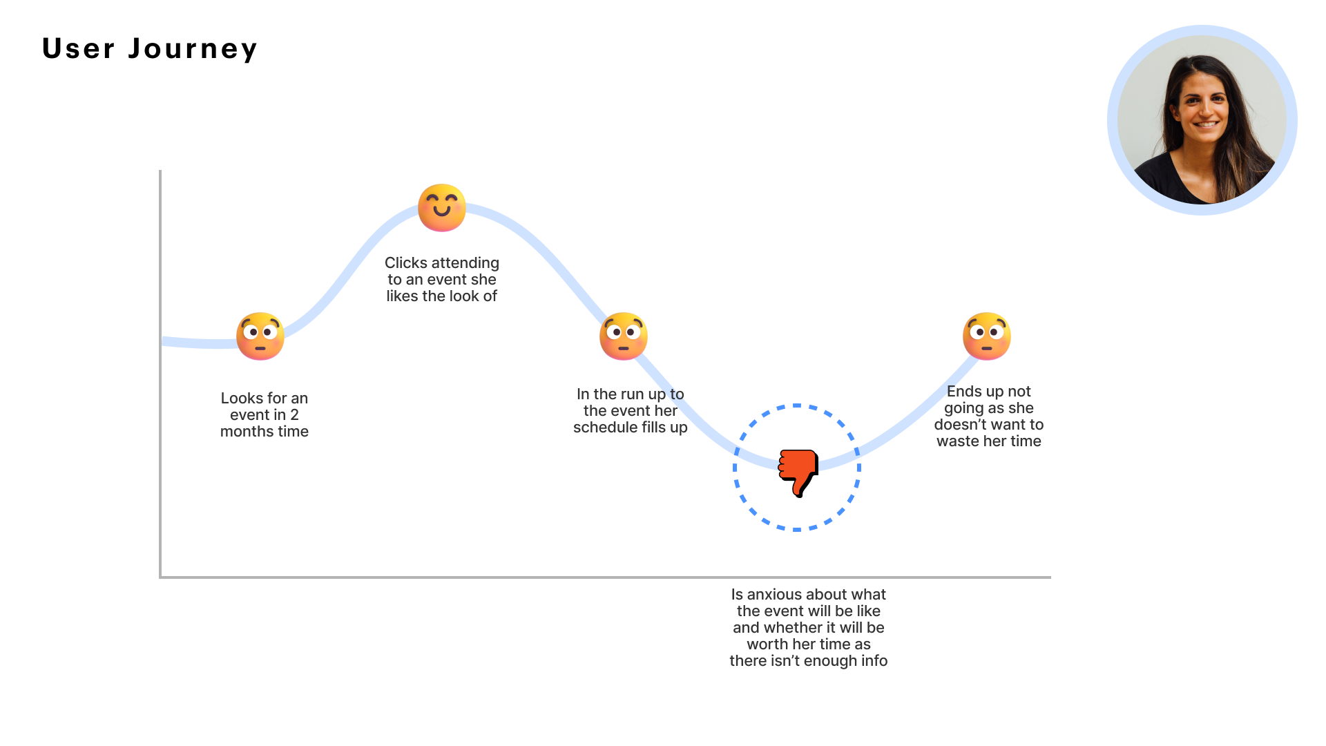
Molly’s problem, on the other hand, is straightforward. We can add more information to the event page and include reviews, videos, and a detailed description of the event. This will probably will result in a decrease in anxiety by knowing on hand what is going to happen on the day.
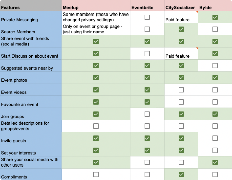
Competitive and Comparative Analysis:
To ensure we were designing a feature that attends to both personas’ needs, competitive and comparative analyses were conducted.
We used Eventbrite, CitySocializer and Bylde as our in-depth competitors, and found that most platforms that include private messaging among members were closer to social networks and they focused less on events.
On Citysocialiser we found some interesting features, like the pre-written message on your bio, which is suggested to a member when they start adding their personal information to the website.
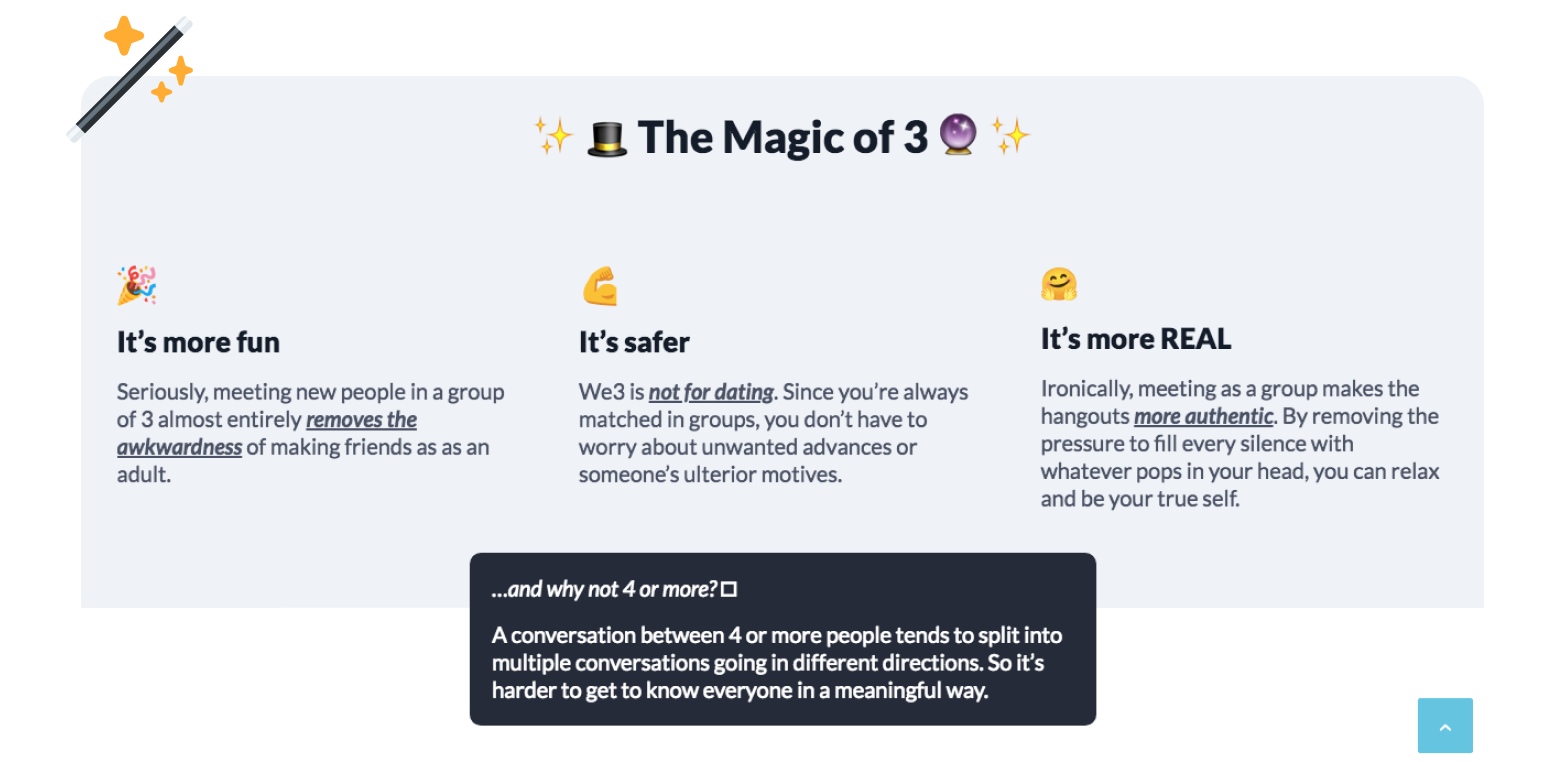
Looking for other competitors, we found a website called “We3”, though we decided not to use it, we took notice of their main feature, (described in the image below), stating that a group of 3 is safer, more real and funnier.
On Bumble, we also found a great way for users to avoid that ‘first message anxiety’ by offering fun Ice breaker questions that both users can answer.

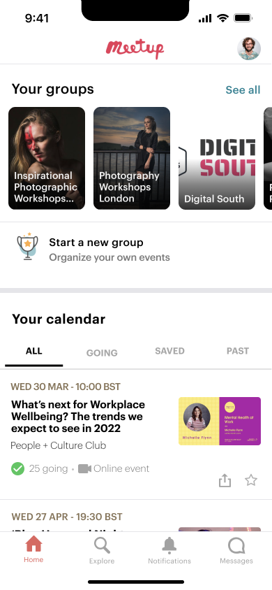
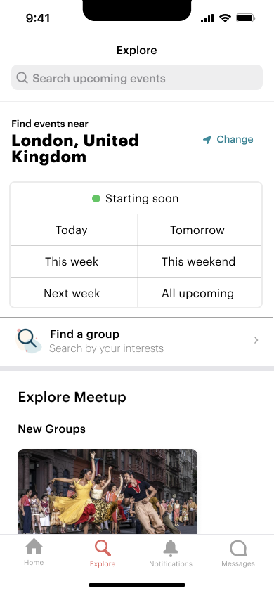
User Flow:
We decided we wanted our feature to work seamlessly with the already working app and the current flow. In the right image, you can see the happy flow with the buddy-up feature inside the app.
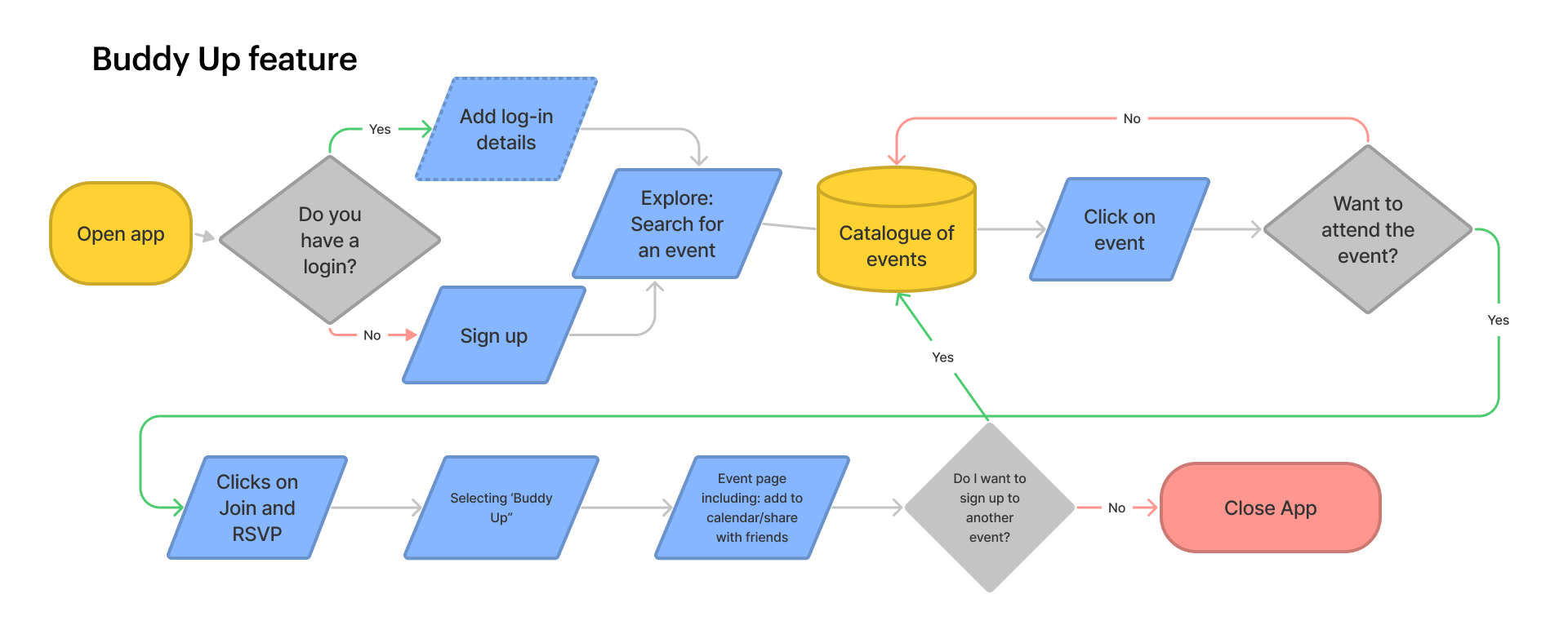
We also worked in a secondary happy flow, aiming to show the interaction between the user and the app, once they receive a notification that they are buddied up for the event.

The Design System:
We started mapping the design system manually, then we came across the Meetup Swarm Design system, which was created as a “living ecosystem” to help developers craft online experiences to bring people together.
Typography
The typography system was created to provide a hierarchy and ensure content is always readable. To keep a consistent voice for Meetup, we used Graphik as the primary typeface and a variety of weights as suggested by swarm design.

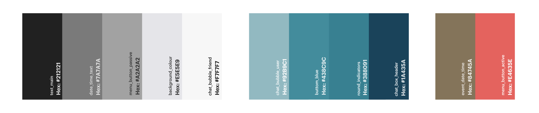
Colour
According to Meetup, the colours “are inspired by both the personality of our members and organizers, and the space they inhabit”. Therefore, we followed their concept and already established system by using the 3 main hues, black, white and blue.
The Solution:
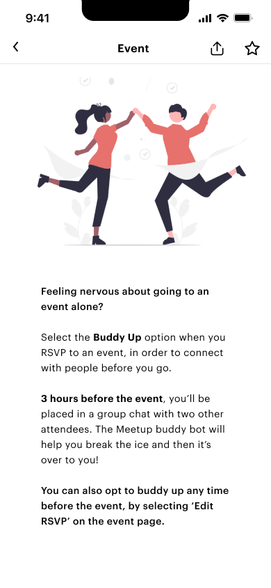
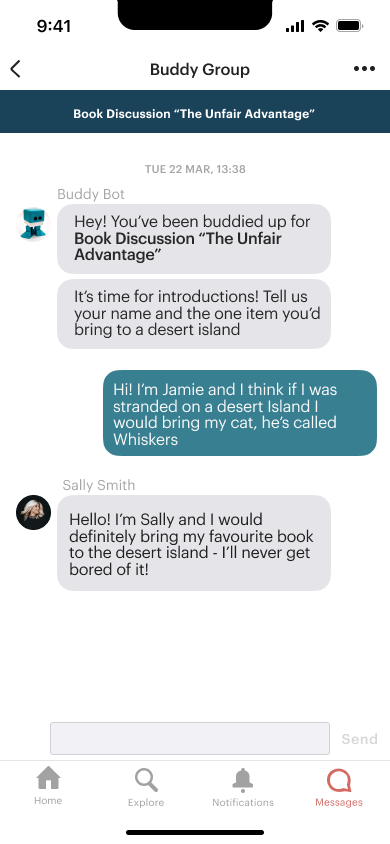
Buddy-Up! A fun and easy solution to your anxiety problem
With this feature, people like Jamie could opt into connecting with someone before an event, if selected, he will be added to a small group of up to 3 people where they can chat before the event. Also, a chat boot will help the group to know each other, with some icebreaker questions. Naturally, anyone can opt for singing in or not.
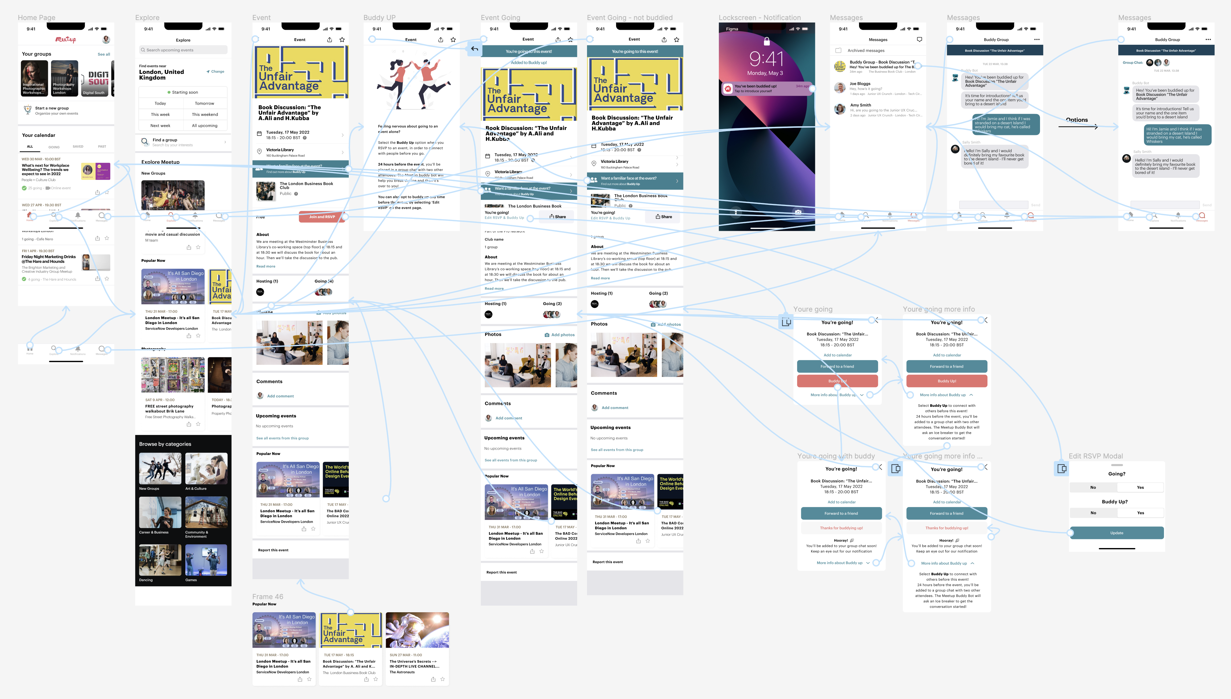
Prototype:
You can browse the images below, watch a video of the prototype in action or if you are feeling adventures, even check the Figma prototype!


Testing with:

A great solution, however…
Maze is a great product that allows the team to collect actionable user insights.
When structuring our Maze test, we included a question about Meetup, asking if the user had used the service before. We included two missions, one for each user flow so we could try and test the functionality of our prototype, and also to help us identify any features or elements that were missing in the eyes of the user.
14 people took our test, 9 on mobile, 4 on desktop and 1 on a tablet.
The team was really happy with the response. 14 people did our usability testing, however, when we saw the frantic heat map we noticed the nav bar was missing!
Luckily, 37% of our users still managed to complete our mission, so we had some data to analyse, plus we also conducted some testing of our own.

Next Steps:
Starting from the obvious, our Maze test wasn’t perfect by any means. Thankfully, we came away with some valuable insights. In our defence, it was the first time we were using the app, and we assumed we did everything correctly. Looking back, we should’ve spent considerably more time checking if everything was perfect. This lesson I will never forget!
We also wanted to further develop the chatbot feature, with the amount of time allocated for the project we didn’t have the proper time to run some prototypes with a chatbot feature, but from our competitors’ analysis, we are confident in the feasibility of it.
Lastly, the team also debated creating a type of visual confirmation on other pages, allowing users to know if they are participating in the buddy-up feature, though we didn’t have time to test it.
What I learned:
The most important lesson on this project was learning how to work in a group and be proactive while allowing each member to shine and be happy that we all took part as equals in the project.
Until this point, I only worked by myself, so it was a shock and a huge learning curve to work as a group. Luckily, we started every day having a group chat, and that gave us confidence in sharing our ideas and problems.
The second important lesson is that people work at different speeds, and at the end of the day, what really matters is that you know that your team member will deliver his part of the time, agreed.
I believe the team did a great job on time management and on communication.