Project
Client: LN+B
My Role
Researcher, UX/UI Designer
Timeline
3 weeks
Tools
Figma, Concepts, Shopify, Zoom, Google From
Team
Mathew Hodgkin, Eleni Tran, Habs Rahman, Ren Nkomo
Skills
User Research, Persona, Information Architecture, Wireframes, Interactive Prototype
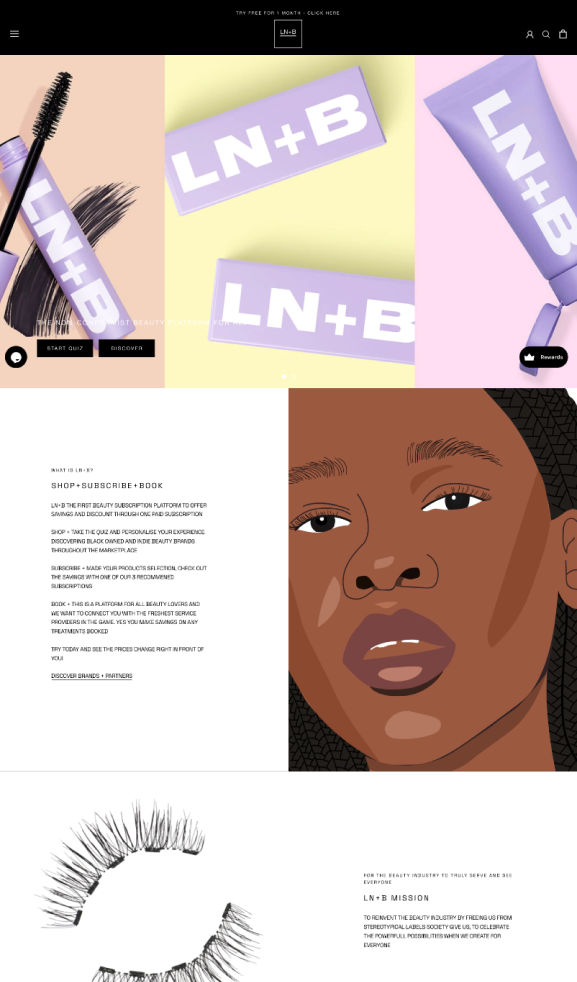
“LN+B is an on-demand beauty subscription service, a space for freelancers, creators, and influencers to share their beauty knowledge and expertise. LN+B is a People-centric platform, where individuals’ needs are at the forefront and not at the product level.”
Problem: The onboarding process is too long and time-based and very manual.
LN+B users are currently struggling with the onboarding process it’s not as instant as it is for brands to integrate into their stores. It is currently time-based and the process is very manual.
Context:
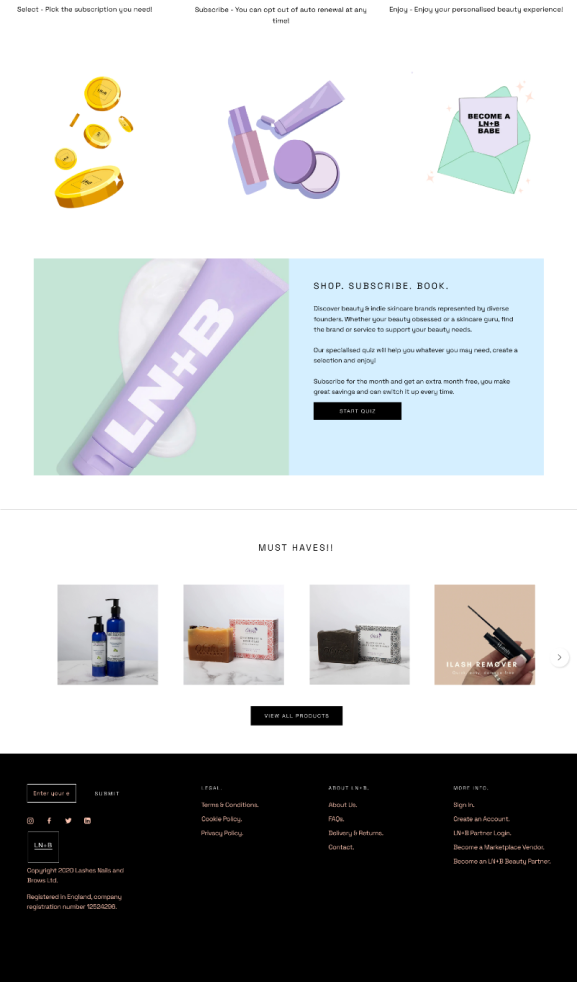
LN+B concept is to fully represent all users, both B2B/D2C across the platform by offering 3 unique elements in one place: Marketplace, Subscription, and Booking.
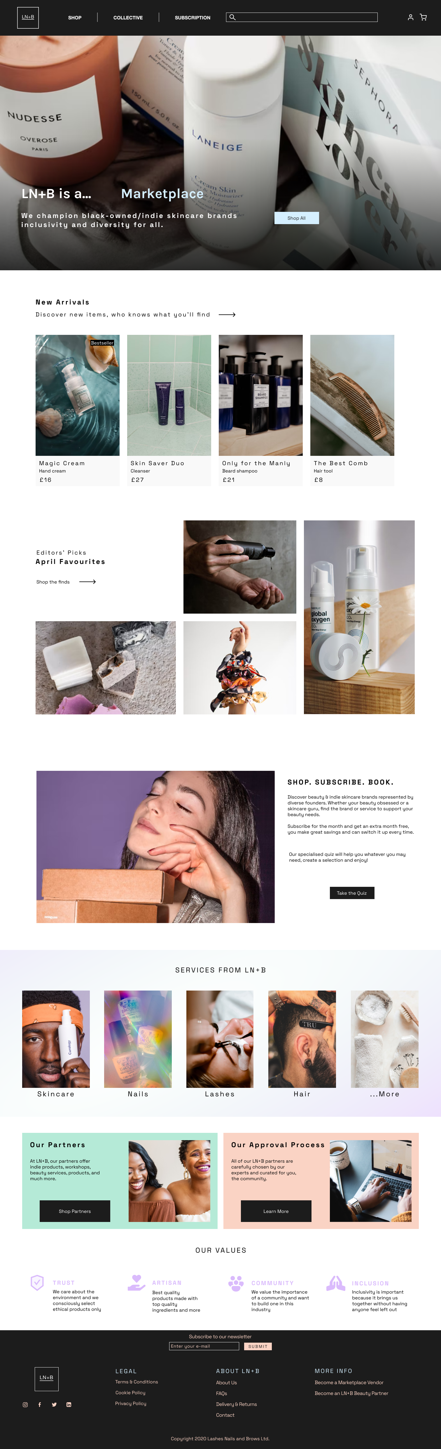
Currently, all these elements are being offered on one page, which overwhelms users with the amount of information displayed. Because of the size of the page, user experience can be negative, since they don’t have any guidance on where they can find the relevant information they seek. The onboarding process as stated is overcomplicated and doesn’t offer any explanation of the reasons why you should interact with it.
Endless one-page website overwhelming users.

Competitive Analysis:
Three main competitors
Treatwell, Living Proof and Hunter Collective were chosen since they offer similar services, consistent onboarding processes and a well-established booking system.
A 24/7 beauty booking platform that places customers and salon managers in control, allowing companies to manage their businesses through client bookings, custom permissions for team members and automated marketing emails.
The website has very detailed haircare quiz questions that users can identify with. Users can also take selfies which would analyse their hair. Users can look through resources such as how-to’s, style guides and tips.

The website offers members the chance to work around their schedules, meet and collaborate with interesting, like-minded people and grow their businesses on their terms. They also provide co-working spaces for freelancers and small businesses.
Task Analysis:
To better understand the onboarding process, we performed a task analysis on the website “Stack World” to assess the number of steps that a user must complete to reach an objective — our goal was to find out key areas where we could improve our user experience and identify opportunities to make a better and more streamline onboarding process.


By analysing these 3 websites, we were able to identify the strengths and weaknesses of LN+B and find some gaps in the market
Strength
Currently, LN+B is the only destination where users can shop for indie brands, book treatments, and access valuable content catered to all ethnic groups.
Strength
Subscription service offering members a 360-degree beauty experience; from products like skincare, makeup and nails to services like male grooming, hair and brows.
Strength
Lack of products and services range. LN+B is still a young website compared to its competitors, therefore, lacking the number of services providers and B2B companies to create a competitive environment as compared to their competitors.
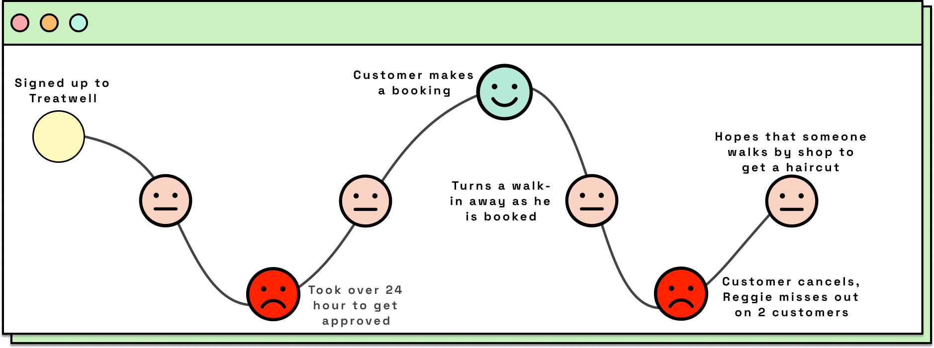
User Journey:
Using one of the principal negative trends on our affinity map, we followed Regie’s pain point when he signed up for Treatwell.
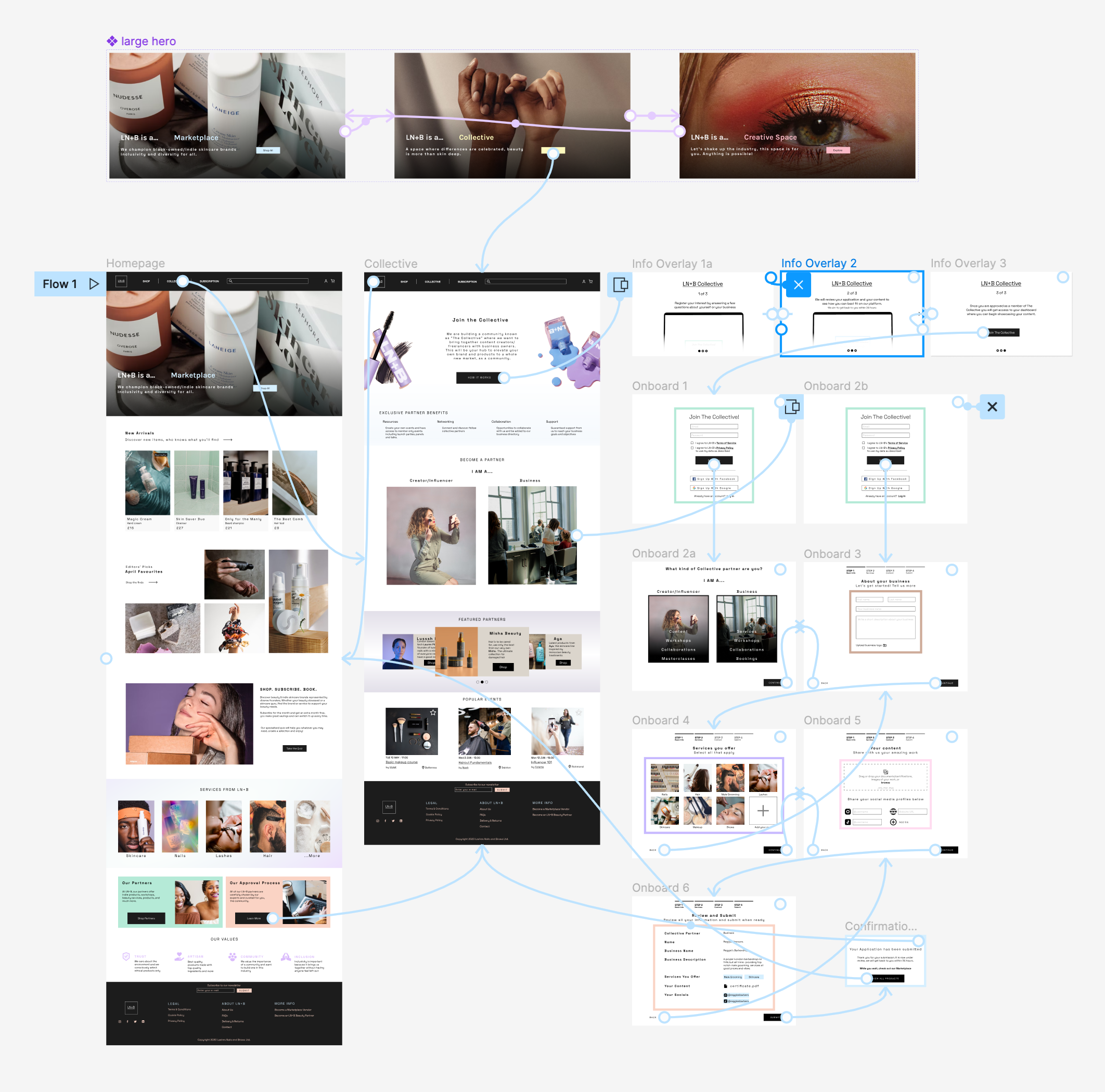
Userflow:
We decided to give two different paths to join accordingly if you are a service provider or an influencer when registering on the website.
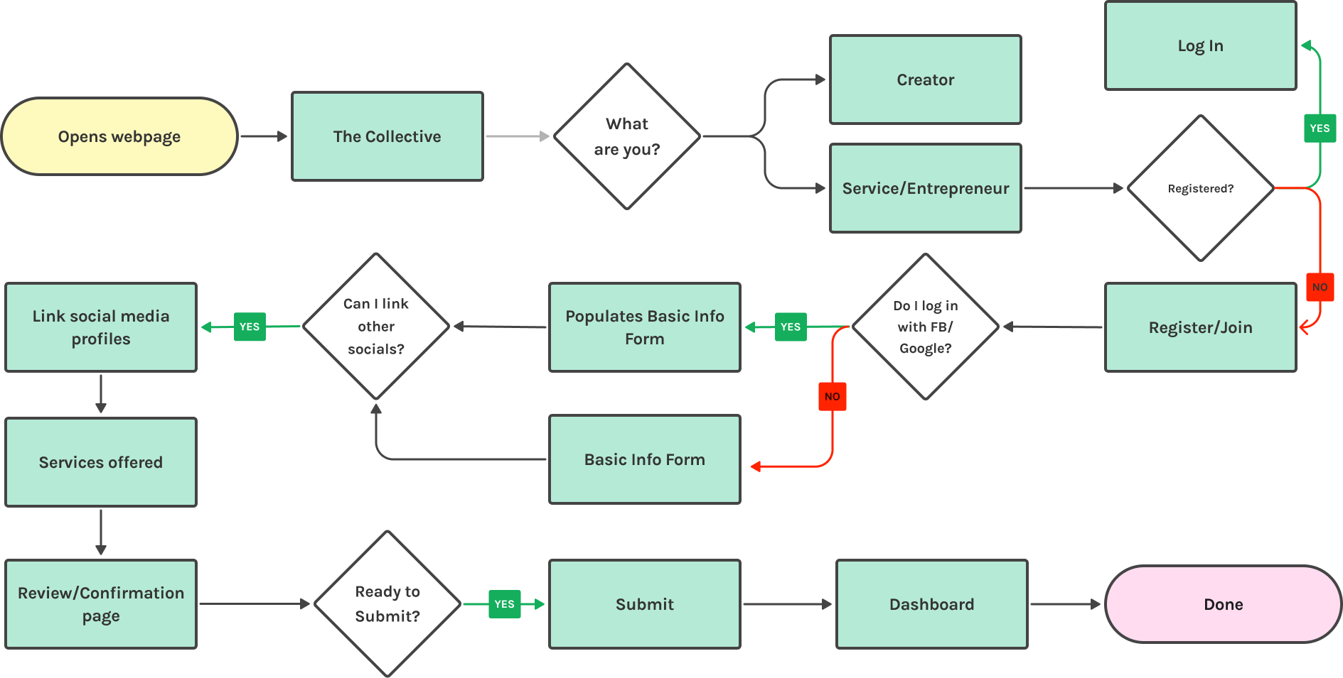
Userflow: Onboarding
Followed by a simplified flow when you look exclusively at Reggie’s onboarding process.
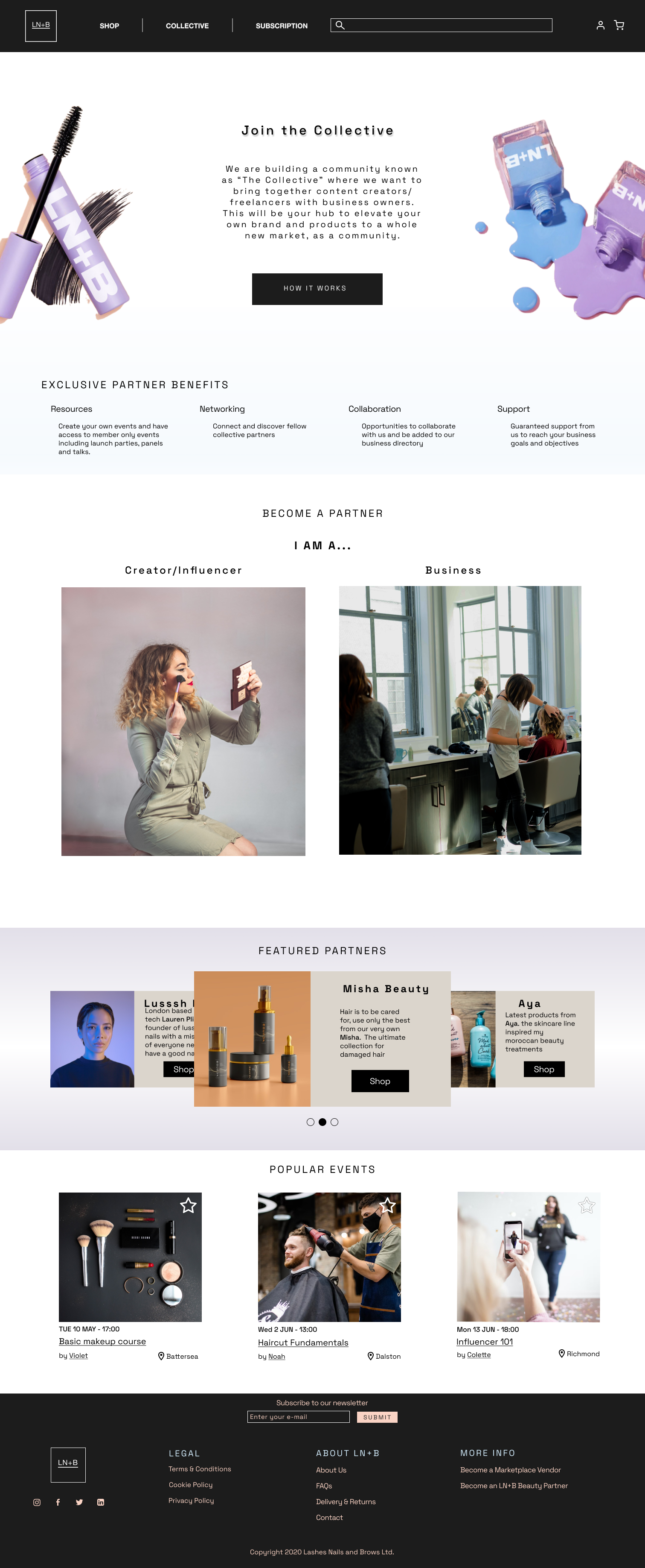
Design strategy and page rebranding:
Previously, LN+B had only one landing page providing information to all its customers, which led to an endless page with too much information aimed at all its customers. A total rebrand of the homepage and the creation of a new page focused on the B2B clients would help to orientate customers according to their niche. This approach would allow customers to experience a more personalised webpage, providing an optimal customer experience by offering just the relevant content to the relevant user.
Design Studio:
After synthesising our research and landing page concept, we asked Sarah, LN+B’s founder, to take part with the team in a design studio.
After two iterations of the design studio sketches, we agreed on some key features:
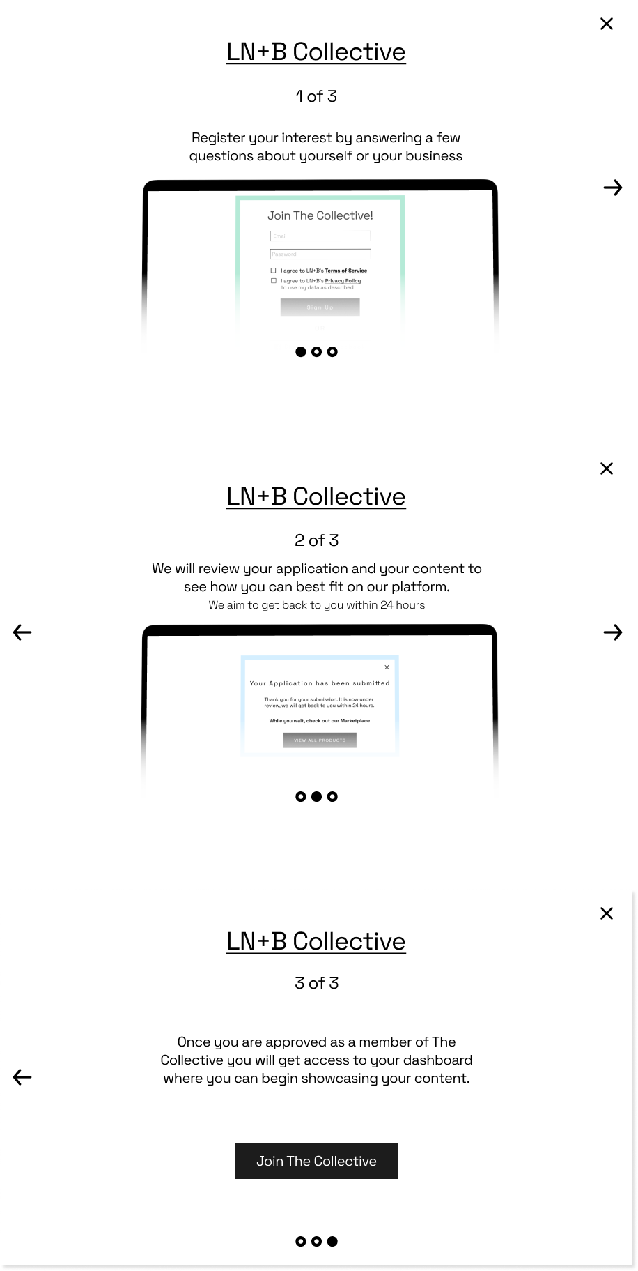
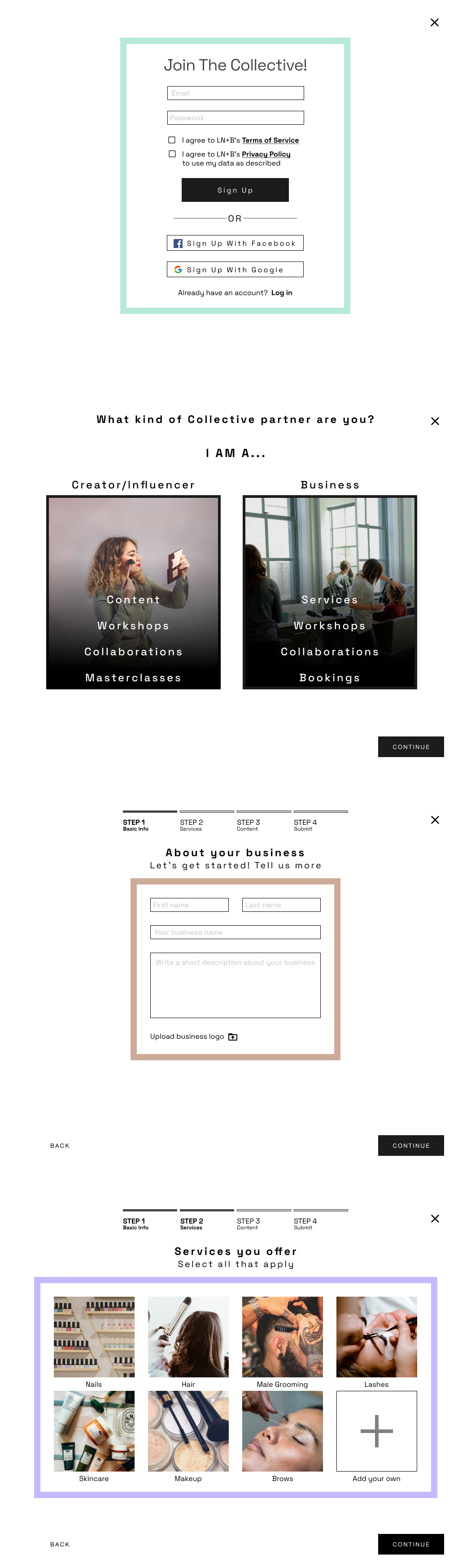
- The onboarding flow should start from The Collective landing page.
- Differentiate creators and service providers on the B2B page.
- The onboarding flow needed to be limited to 3–4 steps and have a verification stage notification.

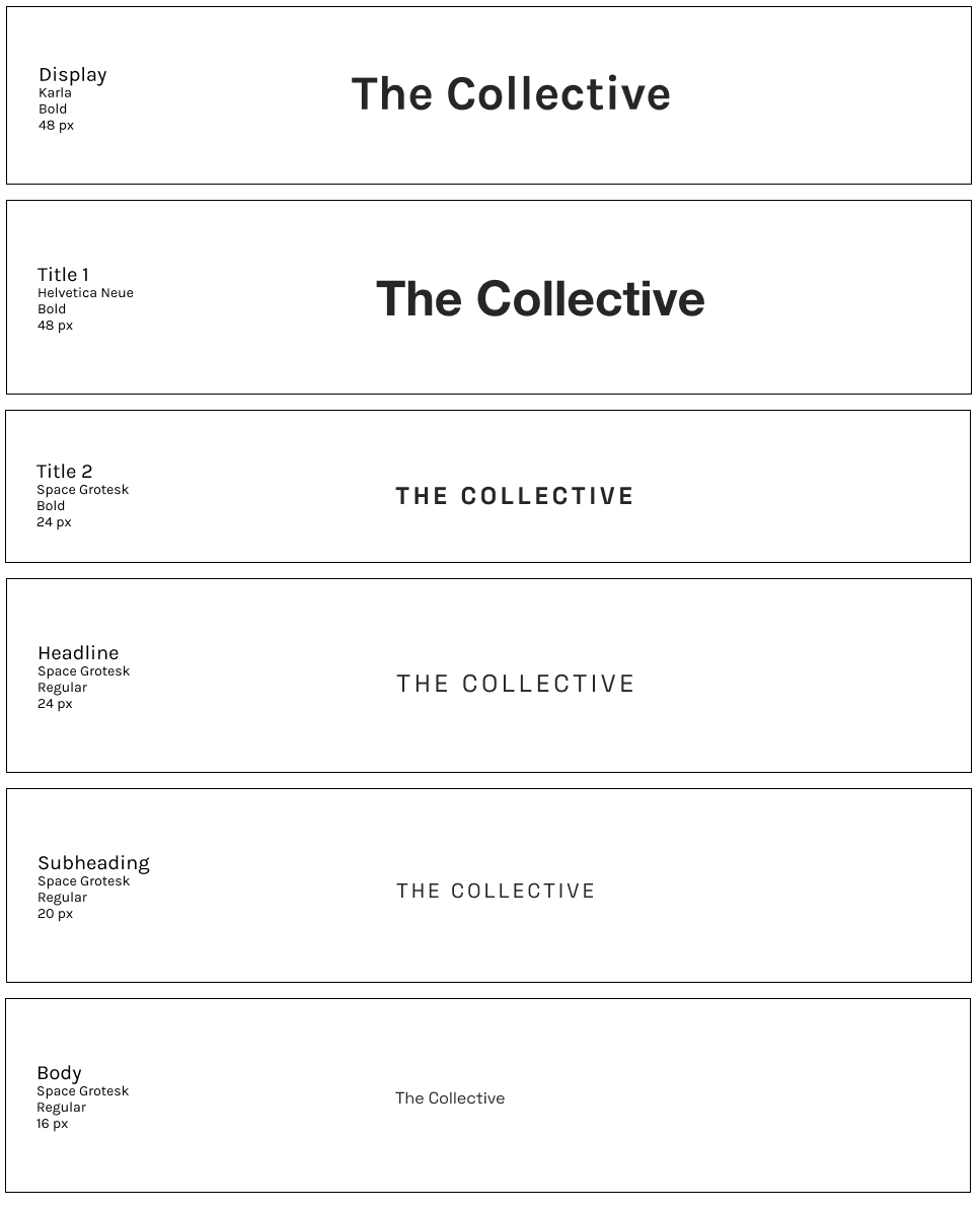
Design System:
LN+B already uses a stabilised design system — the existing brand kit provided the following colours but without any hierarchy or priority. Keeping in mind the goal of appealing to both men and women, we thought it best to limit the primary colours to an off-black, white, midnight grey and the peachy tone as below. We relegated the pastels to be used as accents only. This decision was made from the insights we got from our testing.
We relegated the pastels to be used as accents only. This decision was made from the insights we got from our testing.
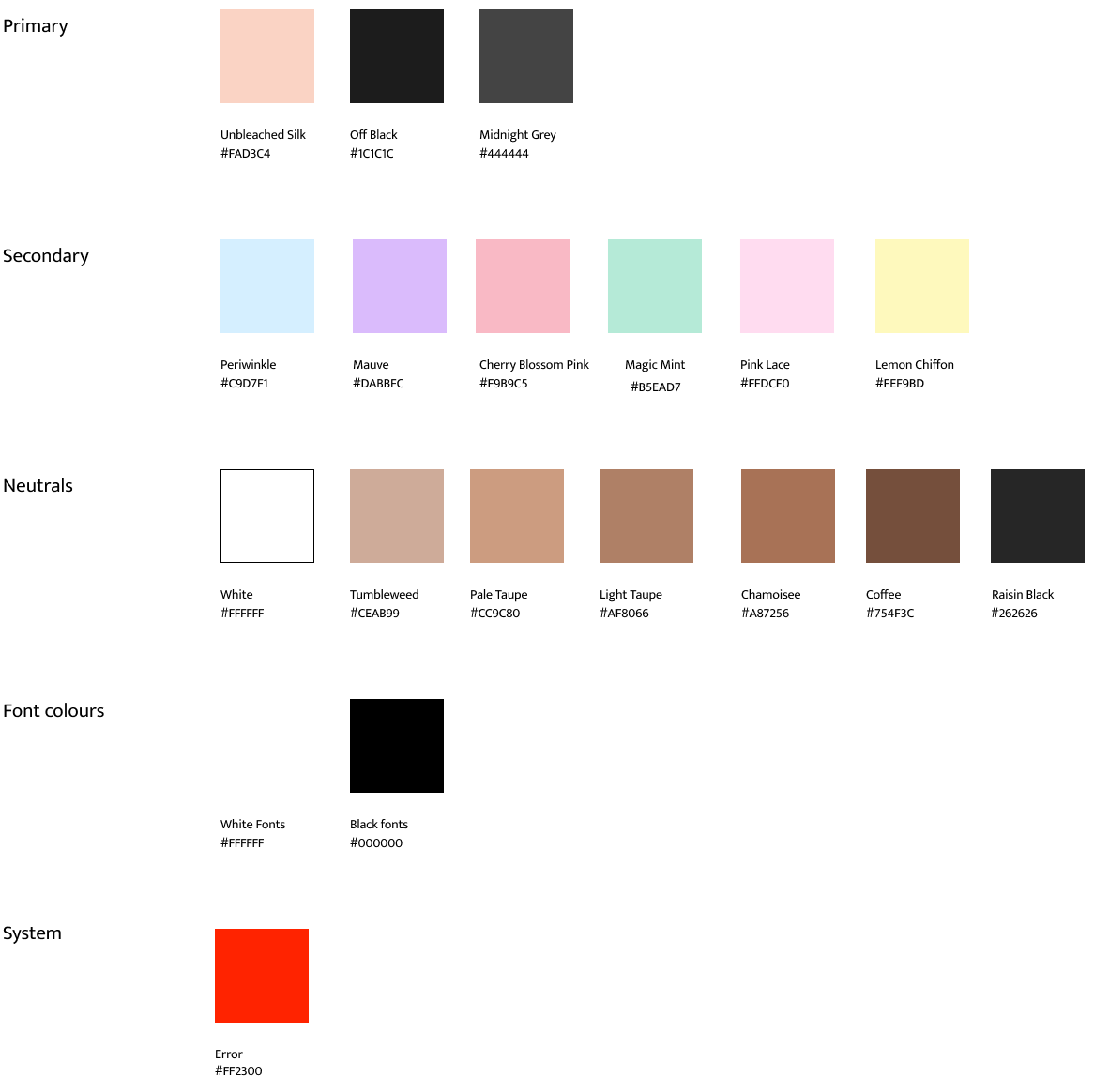
Space Grotesk was the font family used throughout, as the font has a modern vibe that is neither too feminine nor masculine.
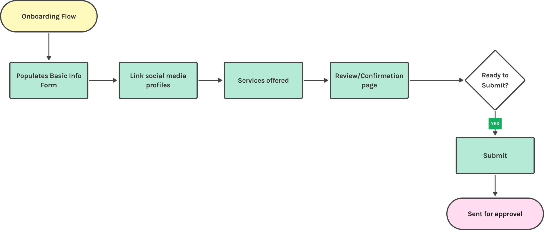
Prototyping and iterations:
Onboarding low-mid fidelity model
We conducted 7 moderated usability tests on our mid-fidelity model. We aimed the test to confirm if users could complete certain tasks. We were also looking for any confusion with not only the path that we wanted them to take but also to make sure there were no issues with the rest of the design.
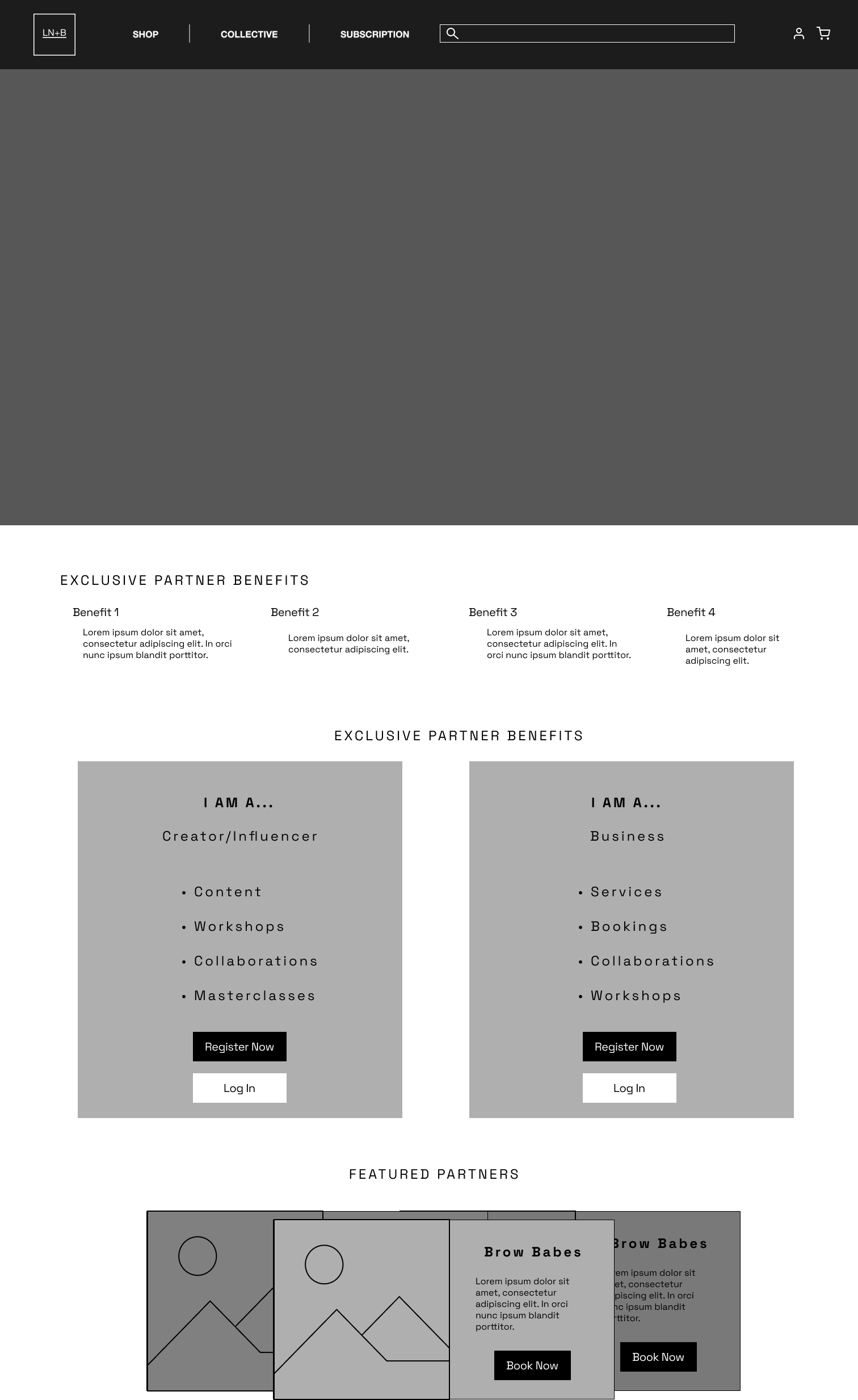
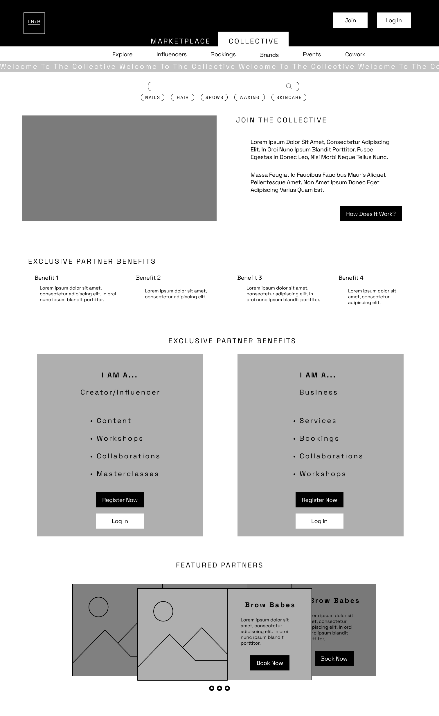
New secondary page – The Colective
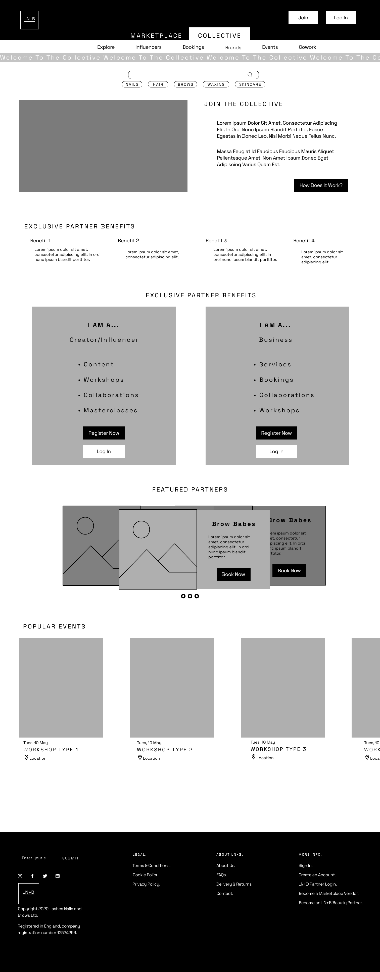
Three entry points
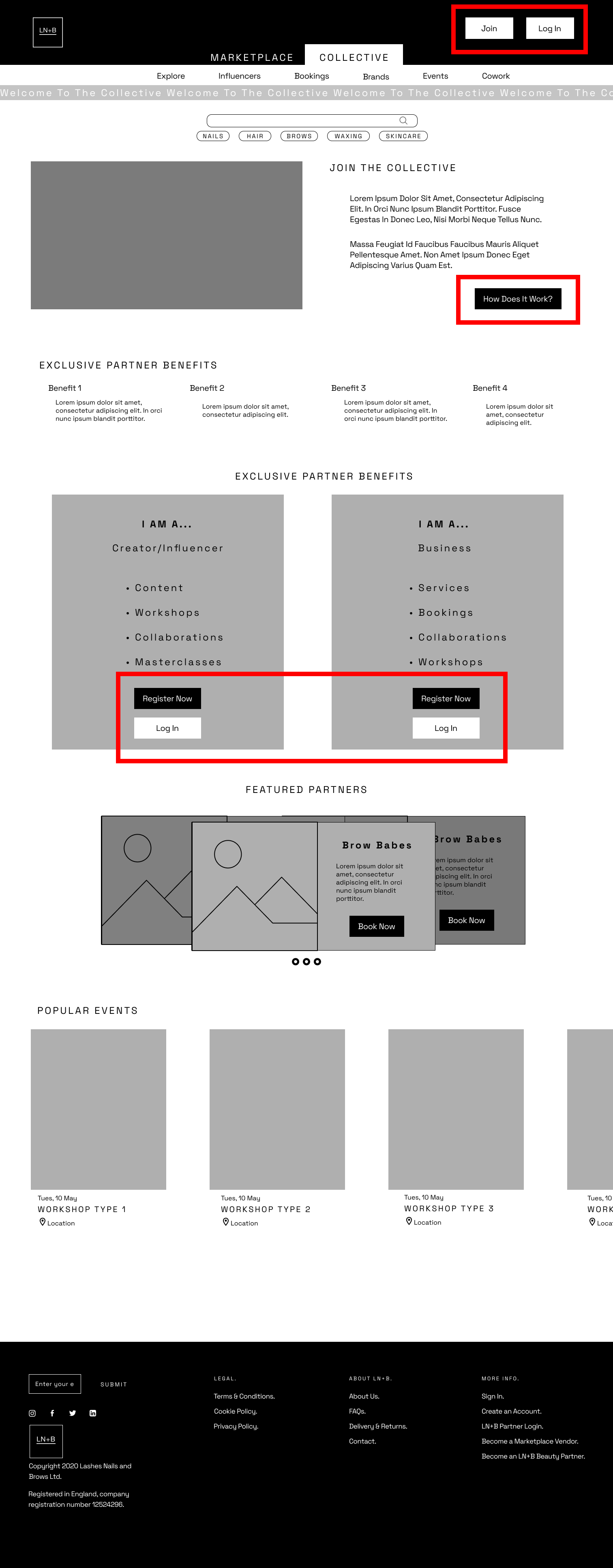
Last screen of the onboarding process

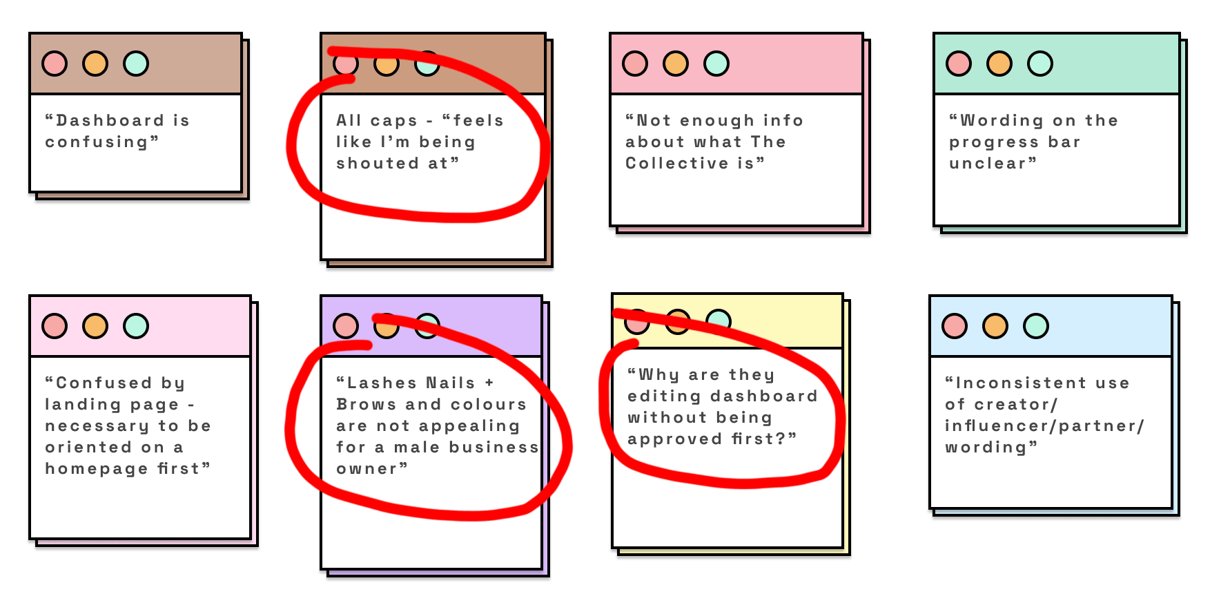
Findings
We concluded that most users were confused by how The Collective Landing page relates to LN+B and reasons to edit the dashboard without being approved first. Below are some of the main comments collected on the zoom interviews.
Main changes
Dashboard – Removed.
The concept would include a profile completion percentage, an area to show where the user application is in the review process, bookings, and products used area and a calendar
Three menu iterations.
With the information gathered, our team went back to the design process and make some changes to the landing page and menu system. We used a simpler menu with just a few entries and added a search bar and shopping cart.
Dashboard
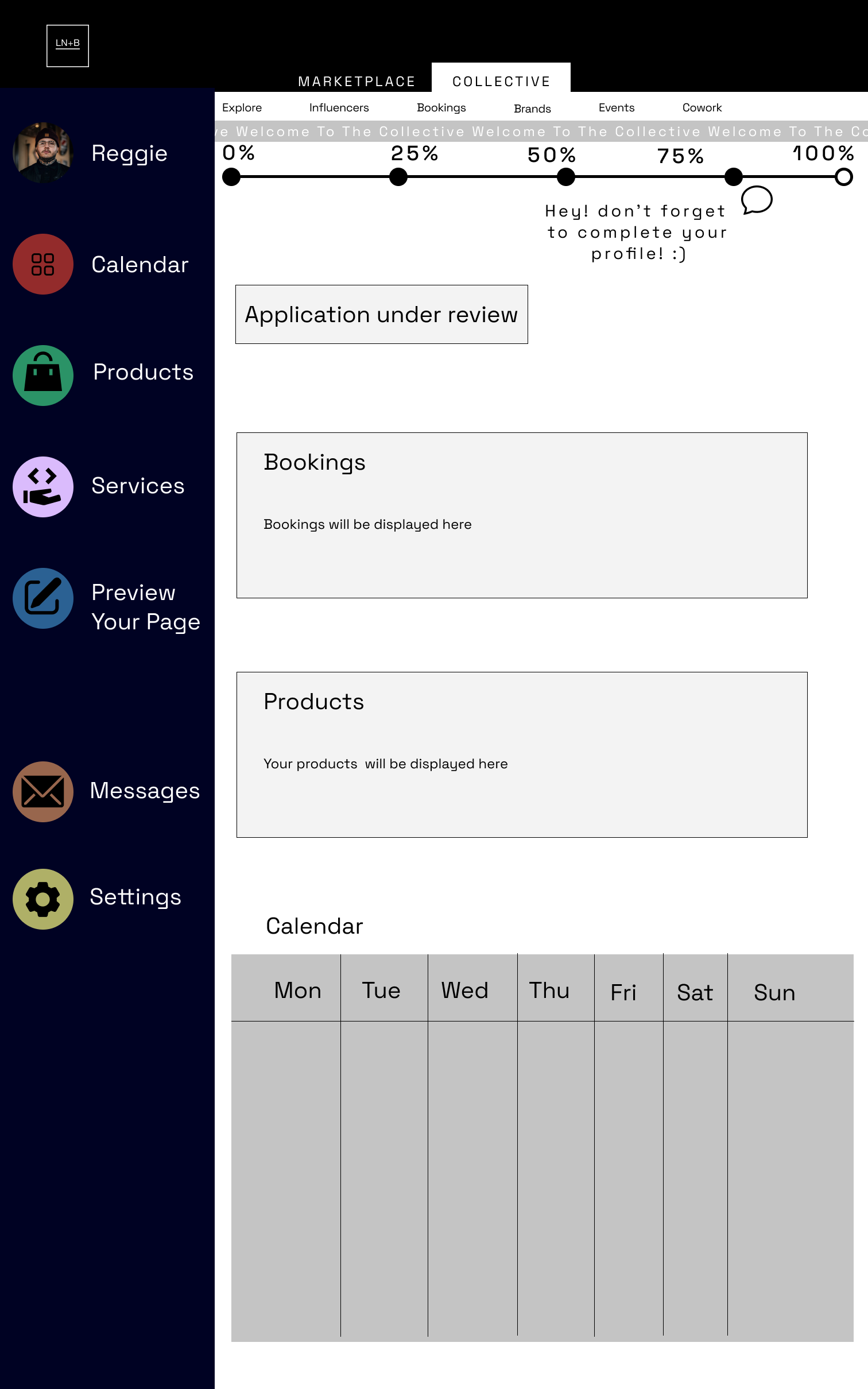
Menu

MID fidelity prototype:
We conducted 9 moderated usability tests via zoom on our mid to high-fidelity prototype. Below, you can compare the changes made to our secondary landing page.
Prototype:
You can browse the images below, watch a video of the prototype in action or if you are feeling adventures, even check the Figma prototype!
So, for the next few minutes, imagine you are Reggie the barber and try to discover how LN+B can help you promote your services and products

Next Steps:
Some of the next steps the team considered doing were:
- Further usability testing on the high-fidelity prototype aimed to refine the design and correct some small sizing issues found during the testing phase.
- Have an automated approvals process in place — currently, the owner wants it to be manual.
- The creation of a community space would be of great value to the platform, but we discarded it because of a lack of time and research on the topic.
- Dashboard — the creation of a dashboard where businesses could add products and services. However, since the onboarding process needs to be accepted by the owner, the team felt that the automatization of the process should be fixed before adding extra features.
What I learned:
Working with a client and being part of a capable and talented group was a great learning experience. My top takeaways were:
- How to present your findings to a client in a way that they understand and support, even if it doesn’t go along with their point of view.
- Team communication is key, and being able to start the day with a team reunion was very important to keep on track, be more productive, and challenge the problems as one strong team.
- How challenging it is to make something simple!