Project
Concept Project
My Role
UX/UI Designer
Timeline
2 weeks
Tools
Figma, Concepts, Zoom, Google From, Optimal Workshop suite
Team
Mathew Hodgkin
Skills
Affinity Map, Card sorting, Information Architecture, Wireframes, Interactive Prototype, usability testing.
Problem:
Design a new user-friendly website with a simple checkout process
Brief:
Prose & Poetry is a neighbourhood bookstore in the heart of Highgate village. They’re proud to be a part of a dynamic community.
With a varied customer base, P&P’s clientele range from local residents to people from around the UK. Their business model is based on customer service, a wide range of literature, reasonable pricing, and keeping it local by employing local staff and support of the community they serve.
A year ago, they started allowing people to order some products online, but just a few visitors completed purchases. P&P wants a website to showcase its products while maintaining the brand image of “small shop” appeal and great customer service. Unlike eCommerce retailers, Prose & Poetry offers a highly curated inventory, focusing on handpicked quality over quantity.
Overview:
Design project of an e-Commerce website for a local bookstore, following an end-to-end UX process using the Double Diamond process. The 4 main phases are; Discover, Define, Develop, and Deliver.
White Paper Research:
How indie bookstores are beating Amazon — The 3Cs Model
According to eMarketer, “about 55 per cent of books are sold online and two-thirds of those sales are made by Amazon.” This meant that lots of bookstores went bust and the ones that survived were forced to adapt. To understand a bit better how this market has shifted I decided to do some research.
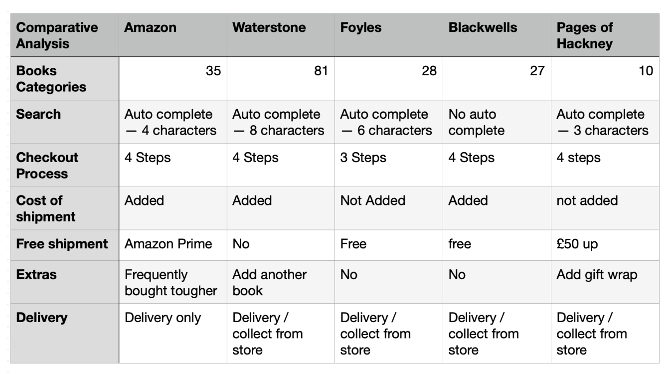
Competitive Analysis:
To be able to offer a revamped website with a bespoke landing page, plus a quick and easy checkout process, it’s important to make an analysis of competitors and compare their features. I compared 5 books shops and analyse their features, and what gaps may exist in the marketing. I began this process by selecting some well-establish bookstores, like Waterstone, Foyles and Blackwells. Also used another small north London bookstore, Pages of Hackney and, naturally, Amazon. From here, I produced a task analysis by performing a task on all websites. By doing this, I could get an insight into what works and doesn’t work.
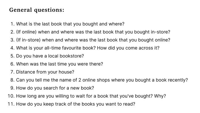
User Interviews:
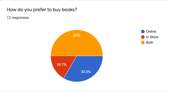
Before conducting interviews for the research phase, I decided to do a screener survey to grasp how people normally buy books and the main store they used. Naturally, Amazon came as the number 1 store, but curiously 50% mentioned that they buy books both online and in-store. Thanks to the screener survey, I realized that though most people complain about Amazon; it is still their main source for shopping for books. This meant that I needed to find ways to ask questions that people could answer either, Amazon if it was truly the best response for them, but also to think about other bookstores for their shopping preferences.
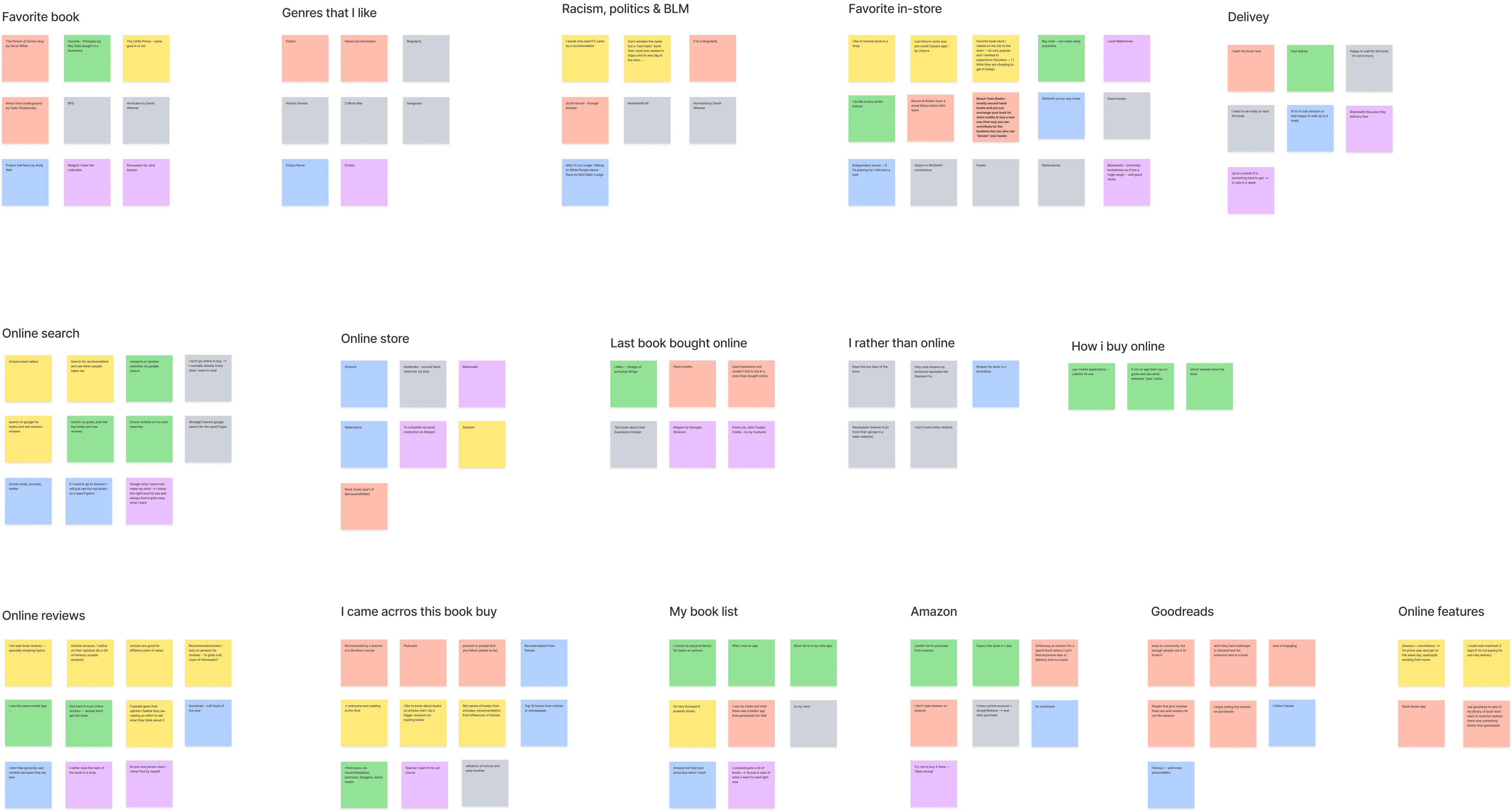
I conducted 8 interviews for this project, and most of my assumptions were correct. For instance, Amazon was the number 1 option for fast delivery, and most people preferred an in-store bookstore within walking distance of their houses. Some answers that I wasn’t expecting were related to online searches and online reviews, with half of the people interviewed, mentioning that they care little about online reviews. They prefer to find new books via friends, newspapers, or influencers. For special books, some people will wait up to a week and most people don’t have any sort of wishlist or tracking system for what book they want to read next.
Main Insights:
I want a fast delivery because I want the book now!
Based on the trends in the affinity map, I’ve noticed two distinct groups. The first is that people rely on the web as a tool to find information about new books, to get suggestions from influencers, famous people, and reliable sources of information like newspapers. The second group has an older age range, and they rely more on the knowledge gained through the years. An interesting fact from the interviews was that, if people perceive a certain book to be easy to access, they expect it to be delivered quickly or free of charge, however, if it’s a “niche” book most people are willing to wait up to a week to receive the book.

Persona:
Creating a persona is a great way to understand and empathise with a user, also helps us to understand that different people have different needs and expectations, especially when designing a product, feature or navigation.
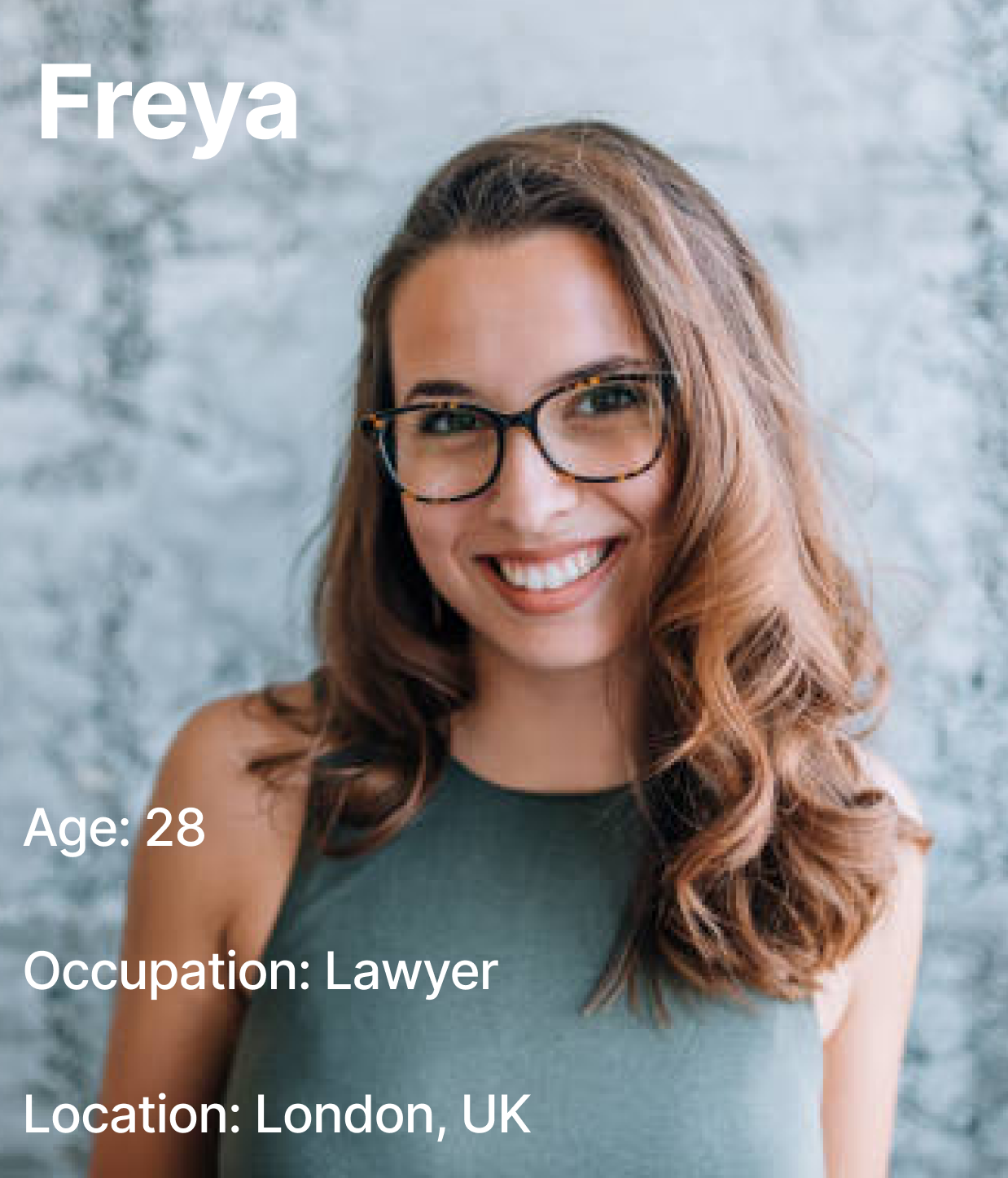
Let's meet Freya
Bio
She loves going to her favourite bookstore; she loves the old smell of books, and the amazing staff that always helps her to navigate inside the shop until she finds her next adventure or, according to Freya, let the next book find her.
Goals & Motivations
- To help her community.
- Share her adventures with friends and/or with a community.
Attitudes
- Loves a good recommendation.
- Always adding more books to her “book list”
Frustrations
- e-commerce website with bad user reviews.
- She wants to navigate the website as she does inside a store.
- She wants to read more biographies but wants personalized suggestions.
User Journey:
In this project, I decided to do things a bit different by doing first the problem statement and HMWs and using them to create a user journey more focused on Freyas’ goals and frustrations whilst shopping online for books.
First, I used the HMWs instead of traditionally using “user problems”, which gave me a unique perspective to evaluate the best opportunities and “user action” according to each “How Might We” statement.
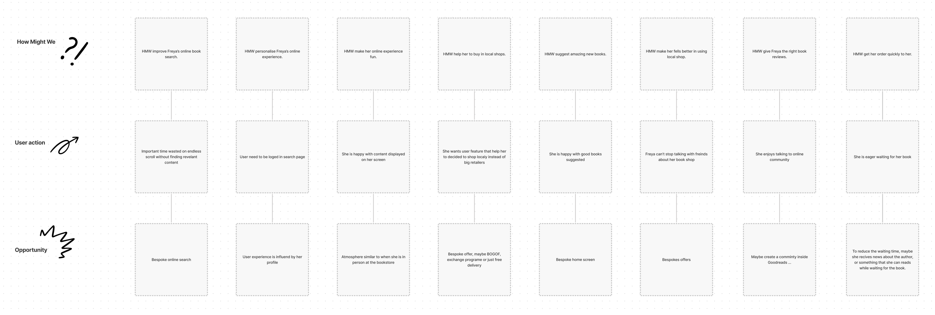
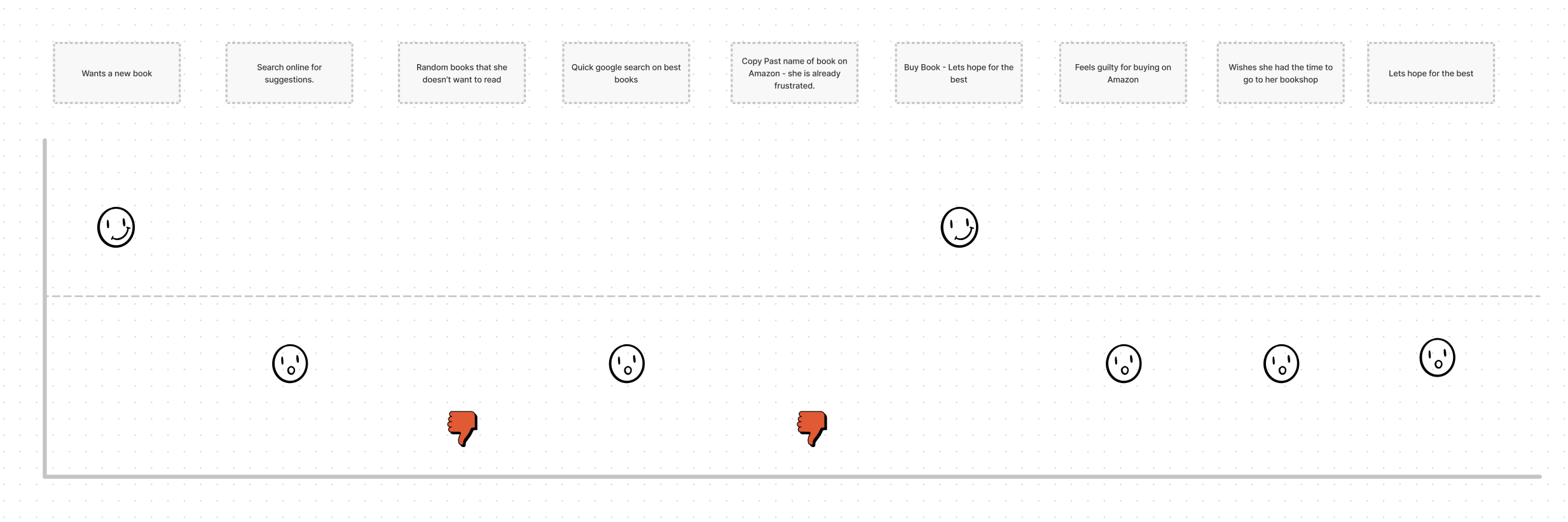
Then I created a simple user journey map just to Freya’s pain points:
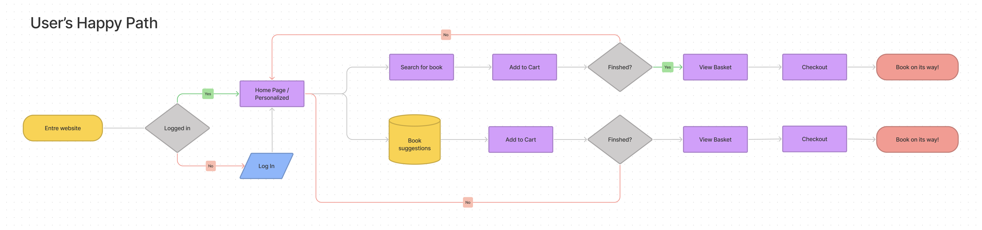
User Flow:
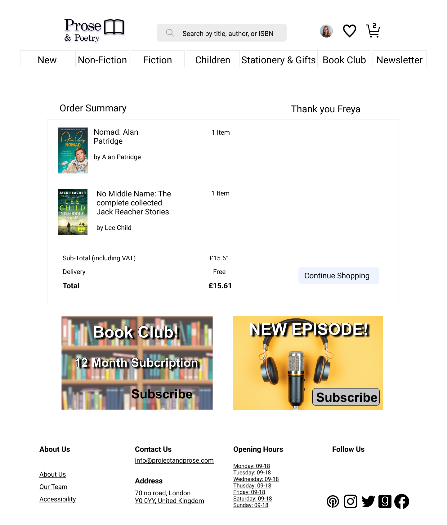
With a clear idea of the navigation on the site, I created a user flow to help present a more seamless user experience. With quick checkout being one of the main features of the new website, I focused the user flow on the happy path!
Information Architecture:
Card Sorting
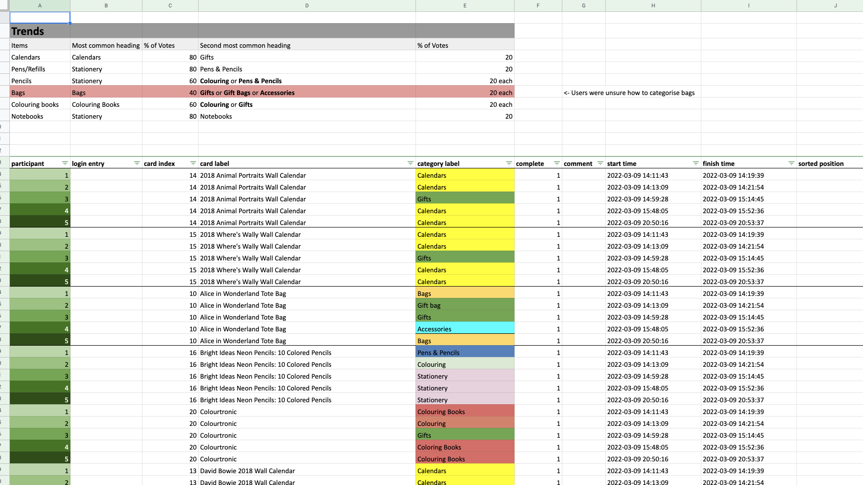
As part of this project, each student received a list of random books and was asked to categorise them into relevant categories, this part of this project was done in groups. Our group received a list of 77 books and other stationary objects that you would expect to find in a bookstore.
We organized in an open card sort, where we assigned the labels to the groups and created as many groups as we thought necessary. With the session concluded, we organized most of the list of topics that we considered “common knowledge” you would find in a bookstore. For the remaining part of the list, we used the Optimal Workshop suite, a moderated online card sort website that provided us with in-depth data analysis.
Below you can see the optimal card sort suit in use and our final categorization of books.

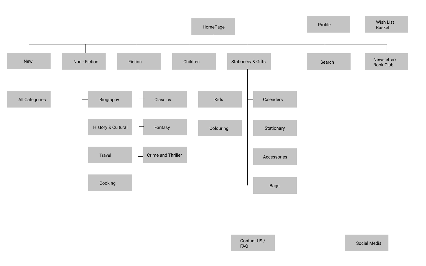
Site Map:
With the information gathered from the card sorting supported by the survey using Optimal Workshop, I was able to create a website sitemap, with an efficient design that the majority of users would find the navigation intuitive and effective.
Ideation:
Sketches:
I started by defining the website’s general look, in other words, the main page. I used the “Crazy 8” so I could quickly generate several looks for the website. Whenever I’m not sure how should I proceed with a design, I like to rely on the “Crazy 8” method, since it takes only 8 minutes and after I have 8 potential ideas/solutions.
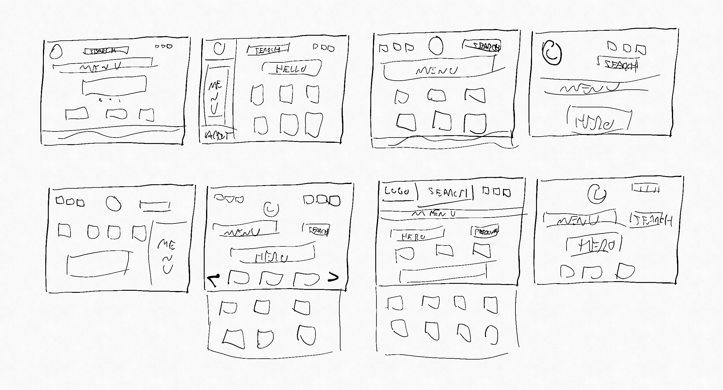
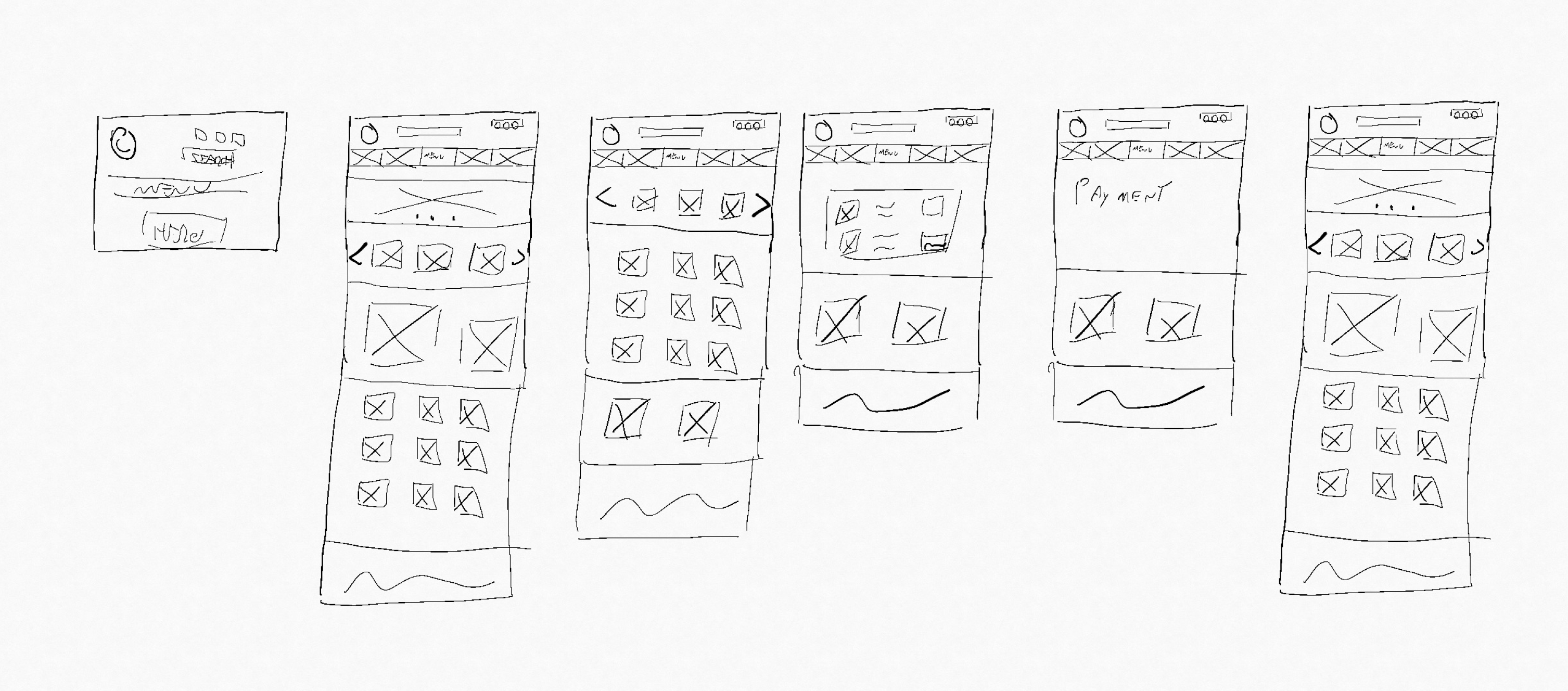
Look & payment process:
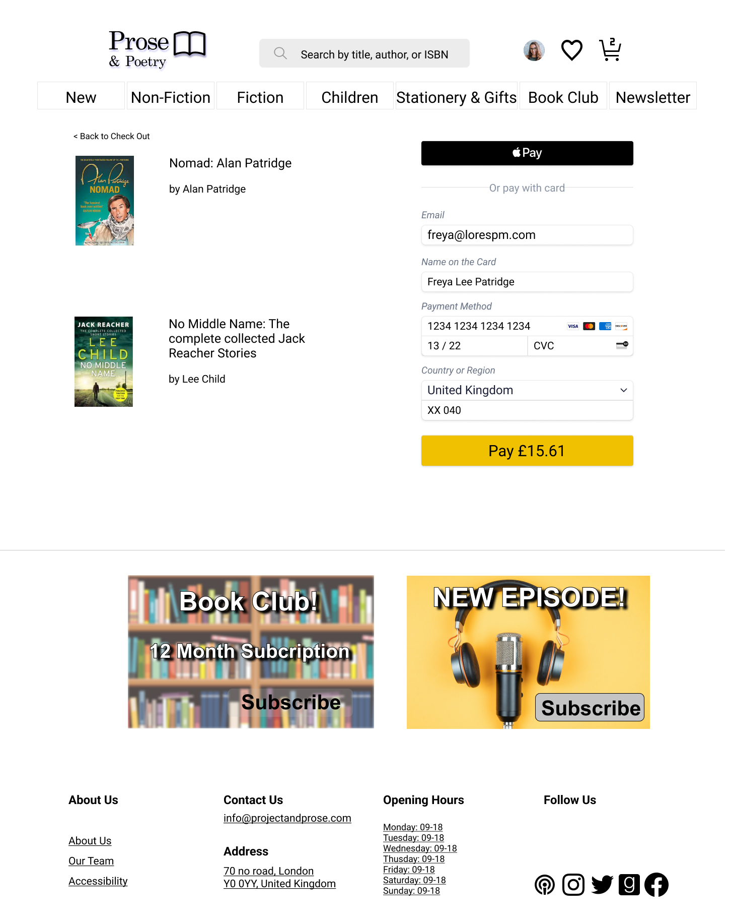
After selecting my main look for the website, I did a quick sketch of the checkout process and start conceptualising the website flow.
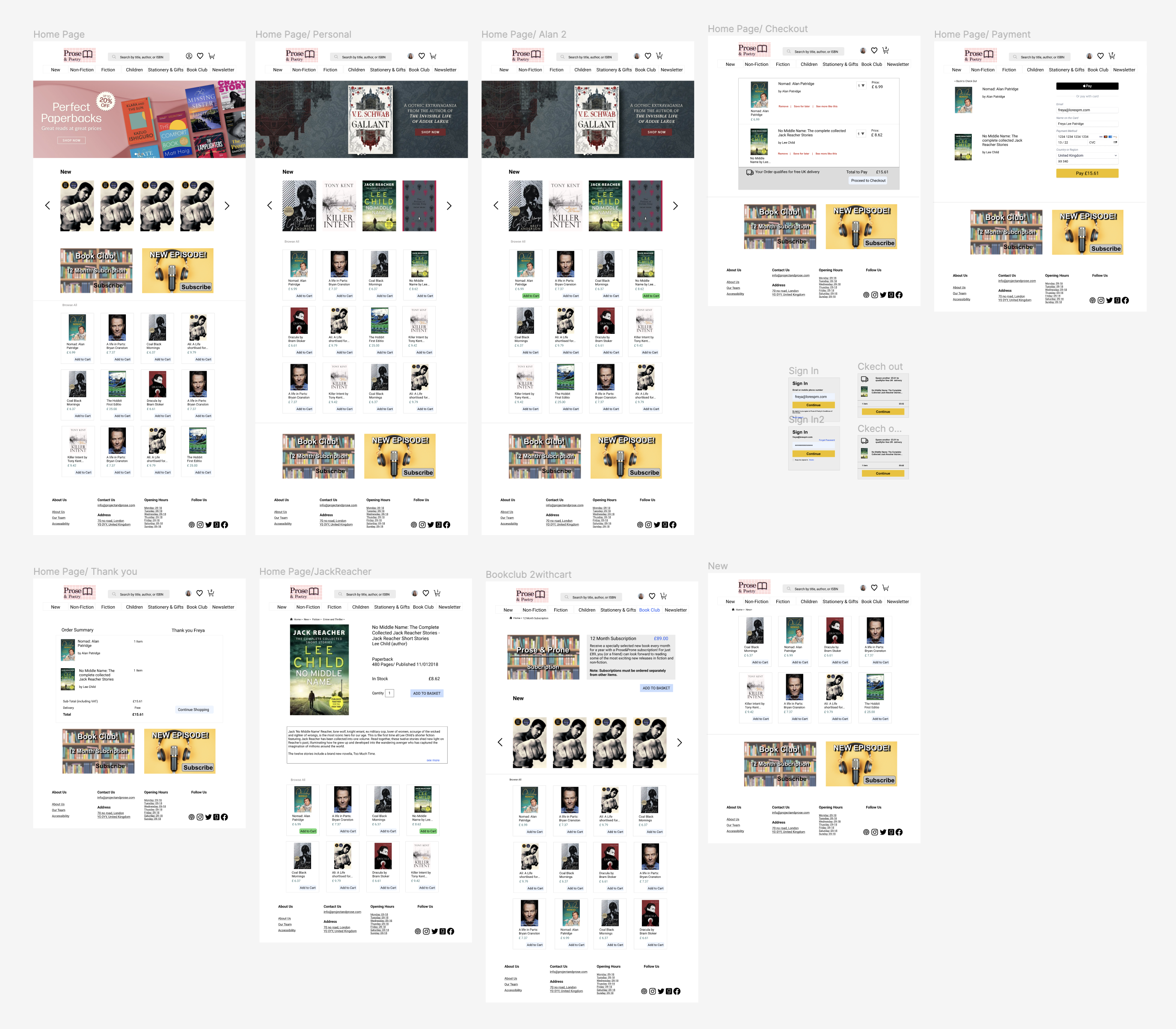
Prototype:
Navigation:
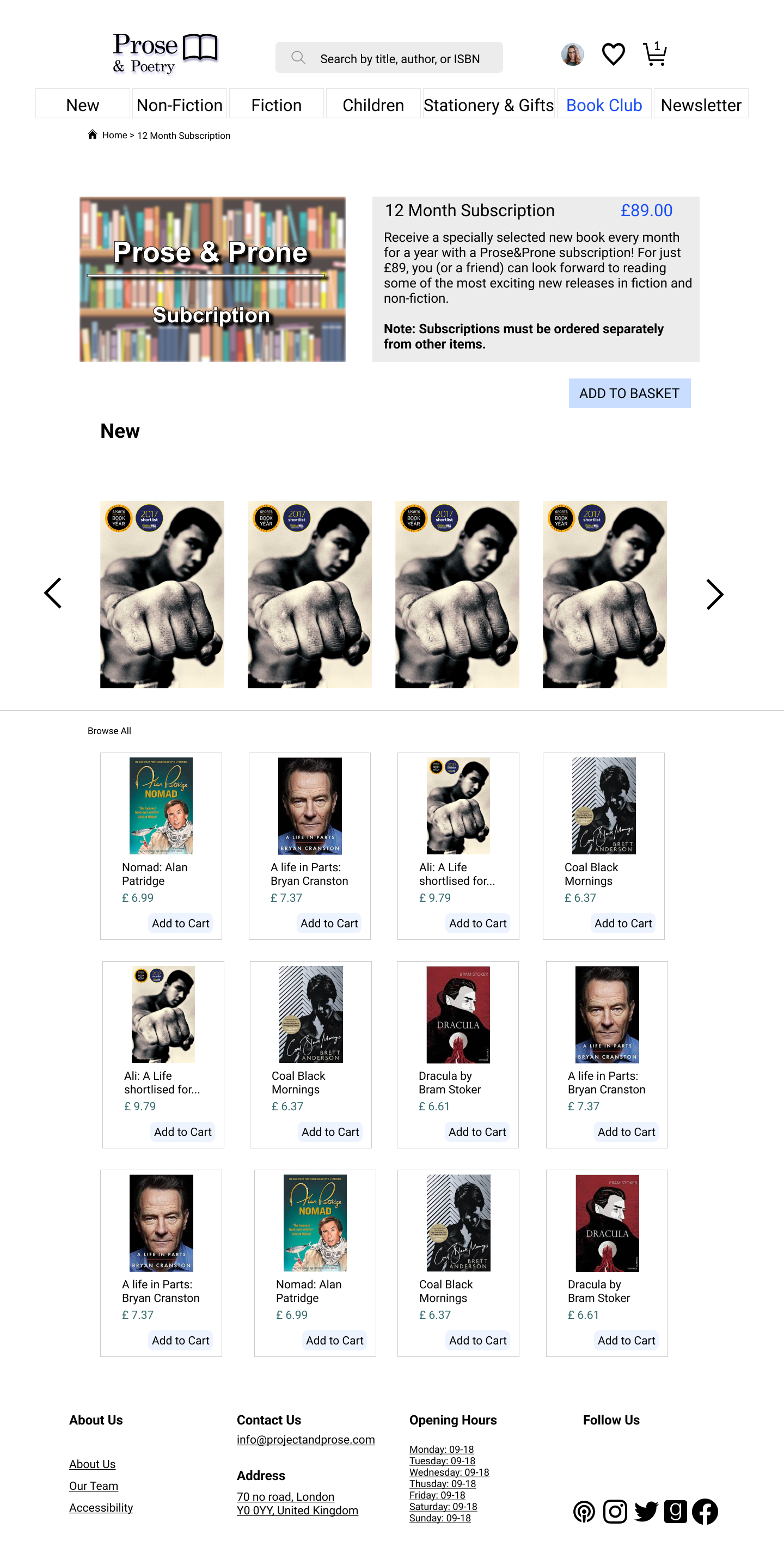
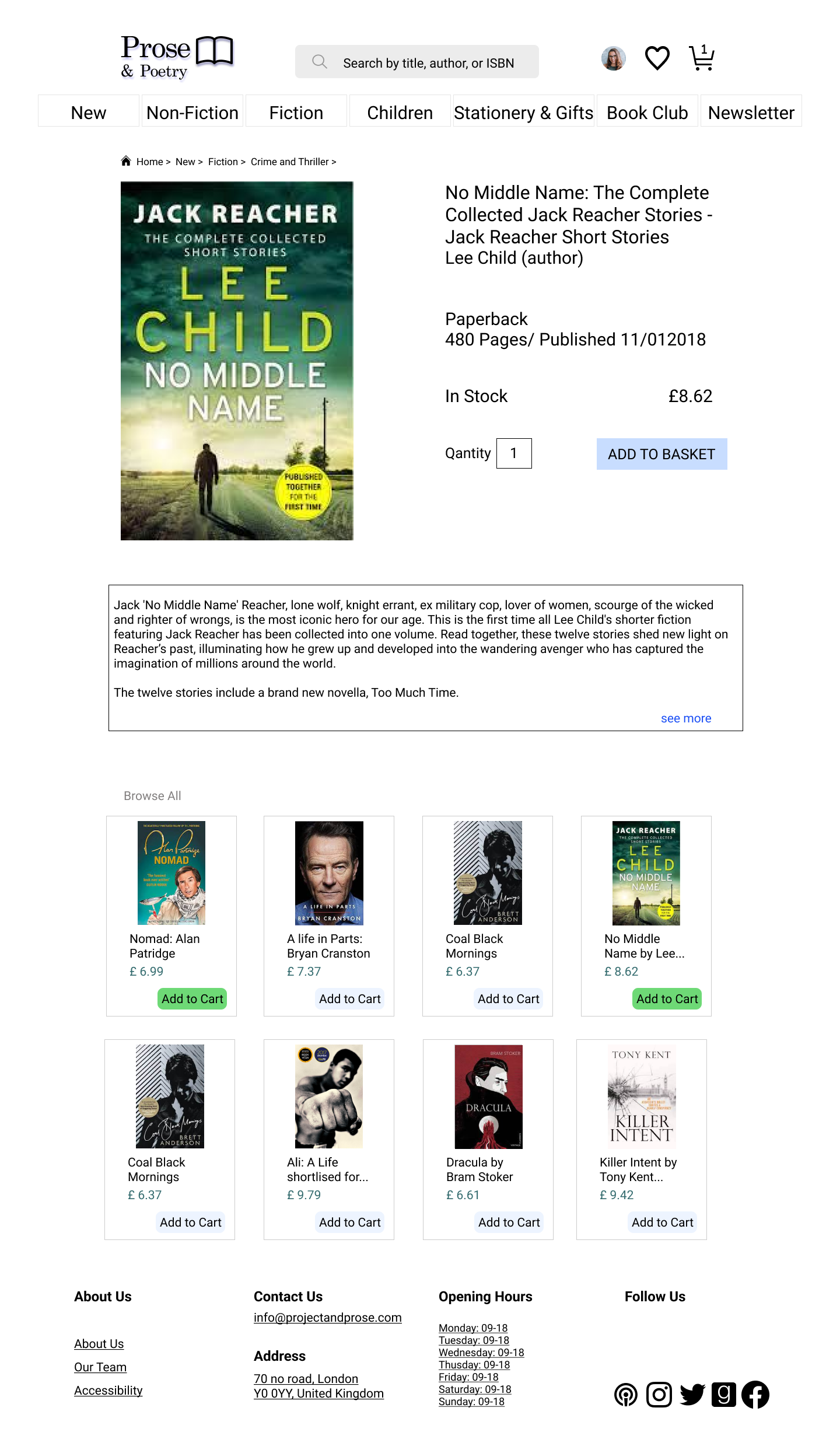
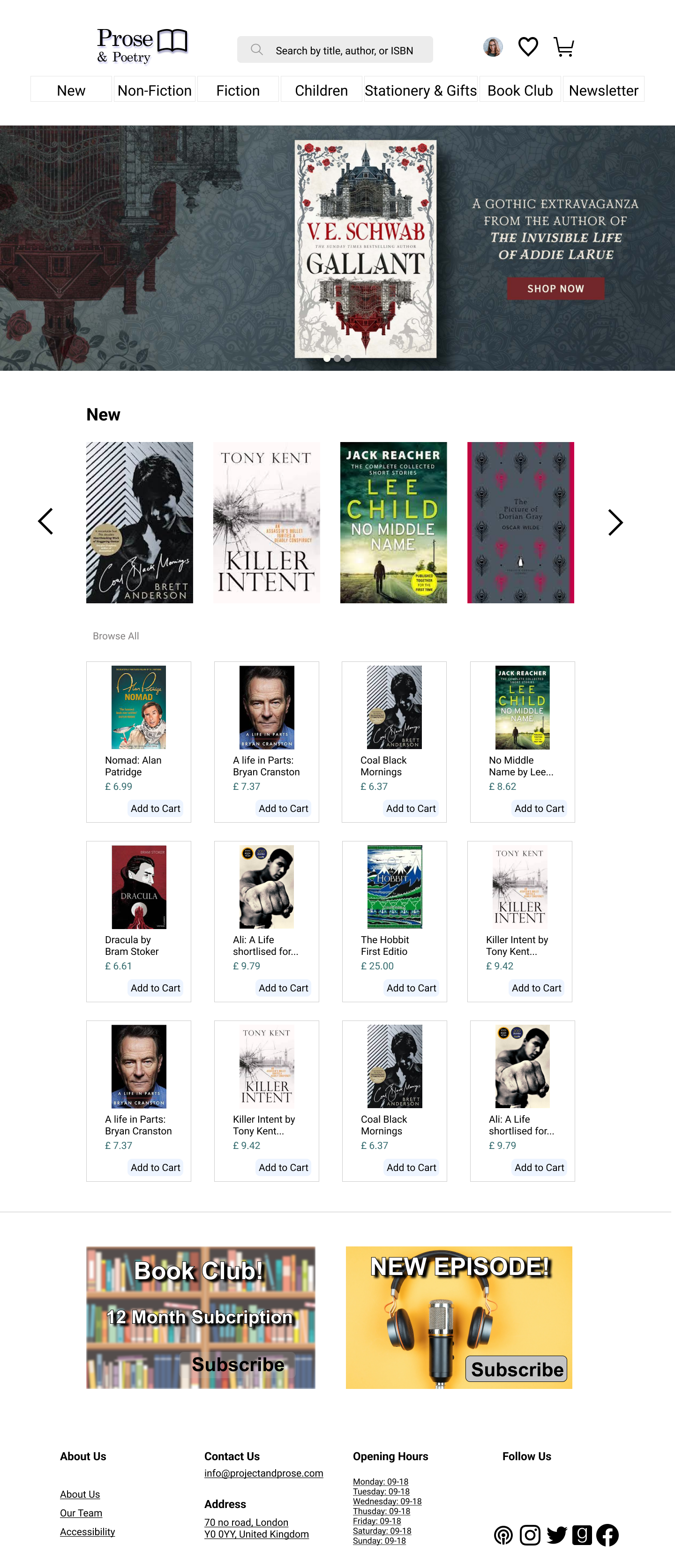
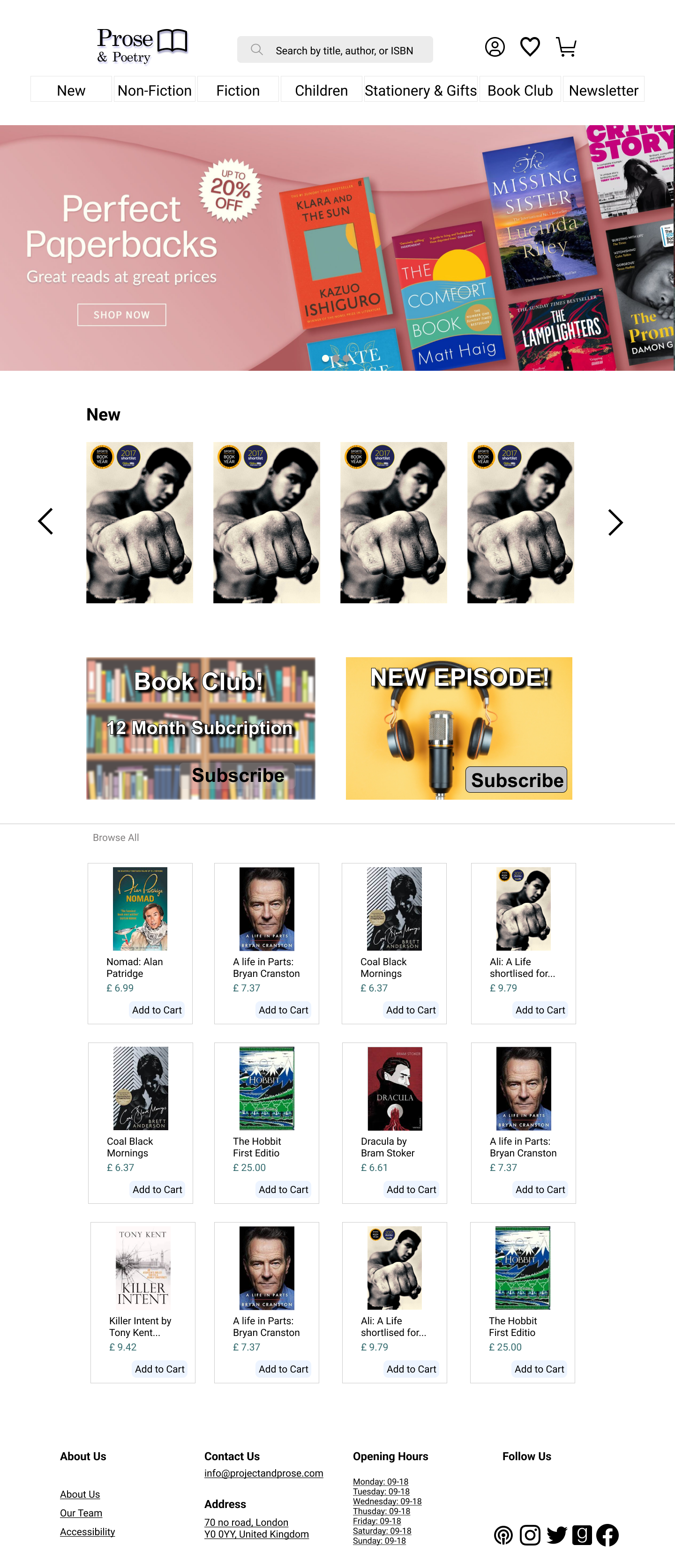
To transform the website into a unique experience for Freya, I started by giving a personalized homepage. This tailored page will display books according to the user’s buying experience and books that they added to their wishlist.
I considered various navigation options to help users around the page. They would comprise a search bar, menu, and breadcrumbs. The search bar and menu would be visible on all pages. This way, the user could type a specific word or navigate on the drop-down menu to narrow the search, according to the book genres. Once inside a specific page, breadcrumbs would inform the user of the site’s hierarchy and give a secondary way to navigate inside the page. To help Freya find that special book she wants, I choose a bespoke home page, which was the best solution found on my testing, since all books offered on this page could be related to her buying history and related topics genres according to her search history.
This also allows Freya to experience and discover books that she is not necessarily looking for, and inside the description of each book, a quick buy option will be given. Which would speed up the purchase process to 3 clicks maximum.
Next Steps:
If I went back in time I would probably do…
- Iterate as much as I can. I would like to spend more time on the design, though I’m happy with the general look and feel of the website, I would like to make it a bit more “funky” with some more vibrant colours.
- Newsletter and Group discussion. I would like to do more user testing on both concepts, on my interviews I found that for most users this is a nice idea. Unfortunately, I was forced to focus on finishing the prototype.
What I learned:
- I learned so many things on this project and also felt constantly challenged with my time management. Also, I really enjoy thinking about the whole bookstore experience, which unfortunately is something that I haven’t done in a long time, to be more precise since I bought my first Ipad, and yes it was a long time ago.
- I learnt how interesting user interviews can be and how hard is to formulate questions that don’t lead the user to an answer that you want to hear. Also, it was hard to keep my interviews within the time allocated, when people are passionate about talking about a topic.
- I lost a long time trying to do specific things on Figma, today I’m happy that I spent the time I did on the software but at the same time, I wonder how much time I could have spent doing different parts on this project.