
Designing Accessibility: The Freebird Club's Transformation
about
Freebird Club
The Freebird Club revolutionises travel for the over-50s, merging safety with the joy of adventure and camaraderie. Beyond mere destinations, it’s a platform for cultural exchange and forging friendships aimed at combating loneliness and promoting active ageing within a community-focused environment.
Project
Client: Freebird Club
Timeline
3 months
Tools
Figma, Miro, Hotjar, Zoom, Slack
My Role
User Researcher, Accessibility Advocate, Visual Design, Prototyping and Testing.
Short on Time? Explore These Quick Highlights!
before
after
problem
How might we improve the Freebird platform to make it more accessible and scalable, fostering deeper connections among older adults?
To enhance the Freebird Club with new features, we addressed critical usability and scalability challenges, ensuring the platform’s growth and its effectiveness for the senior demographic.
As the Freebird Club aimed to enrich its offering with new features, we encountered significant usability and scalability challenges. These barriers not only hindered the introduction of these new functionalities but also threatened the platform’s ability to grow and adequately serve its senior demographic.
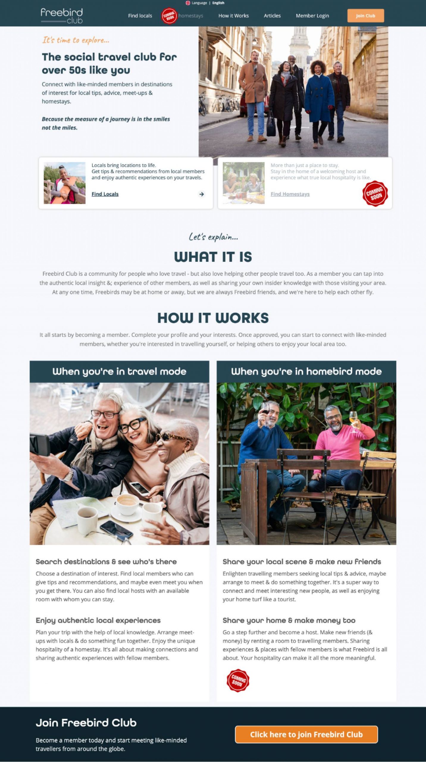
Partial view of the old website, highlighted in purple: Typography analysis reveals 31+ variations in 3 font types.

– Accessibility and Usability Issues: Design complexities hindered usability for seniors, the main user group.
– Feature Integration for Growth: Inadequate design and a lack of scalable, engagement-boosting features like comprehensive chat.
Previous searches offered only basic filtering by location, leading users through numerous pages to find sparse profile details. This underscored the need for an advanced, detailed search capability.

Images of individuals were omitted for privacy.
Phase 1: Core Fixes – Tackled essential accessibility and usability issues to set a strong groundwork for enhancements.
Phase 2: User Experience & Growth—We concentrated on refining the design and adding new features to elevate user engagement and foster platform expansion.

Deliverables:
UI/UX Redesign – Refined navigation, typography, and colour for enhanced accessibility.
Feature Expansion – Added chat services, detailed search, robust profiles, and streamlined onboarding.
Constraints:
Time Pressure – We fast-tracked platform fixes to lay the groundwork for the homestay feature, ensuring swift improvements for future growth.
Freebird’s original site. Dense with info and hidden FAQs. Ready for a navigational refresh.
research
Unpacking the User Experience
Quick Process Snapshot:
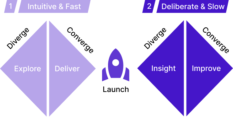
Phase 1 – Intuitive Ideation with AI: Applied Dual Process Theory’s System 1 to make swift, intuitive choices, enhanced by AI for unbiased insight during initial redesign.
Phase 2 – Analytical Synergy: Blended instinctive ideas with System 2’s detailed analysis, achieving thorough, user-focused designs.
Harnessing AI for UX
During the discovery phase, AI accelerated our interface evaluation, bypassing extensive user research. It enabled swift identification of user needs, merging design expertise with AI for rapid crafting of user personas, affinity maps, and accessibility tweaks. This approach expedited initial analysis, facilitating immediate platform enhancements.
Design Strategy Overview:
We adopted a unique design strategy integrating the Dual Process Theory and the Reverse Double Diamond framework. The Dual Process Theory, which distinguishes between fast, intuitive System 1 thinking and slow, analytical System 2 thinking, allows us to approach design challenges creatively and critically. In tandem, the Reverse Double Diamond framework guides us through a structured process of identifying solutions and backtracking to understand their impact, ensuring our designs are innovative and grounded in user needs.
Our Two-Phase Approach:
Phase 1: Intuitive Exploration – Leveraging System 1 thinking for rapid ideation with AI tools like ChatGPT to offer unbiased insights and rapidly prototype solutions.
Phase 2: Analytical Deep Dive – Using System 2 for detailed evaluation, involving rigorous user research and testing, refining our designs into robust, user-centered solutions.
Synergistic Approach: A Balanced Pathway to Innovation
Merging the strengths of intuitive and analytical thinking, our design process represents a comprehensive approach to solving complex UX challenges. By balancing quick, creative ideation with meticulous, evidence-based refinement, we create solutions that are both innovative and deeply attuned to user needs, resulting in a platform that is accessible, engaging, and ready for the future.
ChatGPT-Assisted Personas: Leveraged ChatGPT and data to craft user personas, guiding our design with insights on older adults’ adventurous and social inclinations.
Persona Highlights: Focused on safety-conscious older adults who value engaging travel and cultural connections.


User-Centric & Safety-Focused: Leveraged empathy mapping to grasp older adults’ travel needs, emphasizing safety and social engagement for a secure, community-rich platform experience.
Deep Connections: Prioritized features enhancing community interaction among active travellers, driven by insights into users’ desire for meaningful connections.
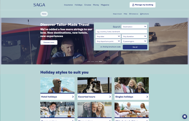
Colour Palette: Saga’s site blends calming blues and greens with neutral tones, appealing to an adventurous senior demographic.
Contrast & Readability: High contrast and readability cater to viewers with varying visual needs.
Imager: Engaging travel imagery stimulates the spirit of adventure.
Typography: Clear fonts support legibility, benefiting older users.
User Experience: A user-friendly interface facilitates easy content discovery.
Saga Website Analysis
Airbnb Website Analysis

Colour Scheme: Airbnb combines neutral tones with vibrant highlights, creating a modern, inviting space.
Contrast & Readability: The site’s high contrast ensures legibility for a broad user base.
Imagery: Airbnb showcases distinctive travel locations to entice exploration.
Typography: The Cereal font echoes Airbnb’s friendly, approachable image, focusing on readability.
User Experience: Streamlined navigation and booking processes enhance ease of use.
Understanding User Needs
In Phase 2, we focused on the specific needs of our senior audience. Detailed user research drove improvements, particularly in enhancing navigation and streamlining the onboarding process. This careful refinement aimed to make the platform more intuitive and accessible, aligning with the preferences and requirements of our mature users.
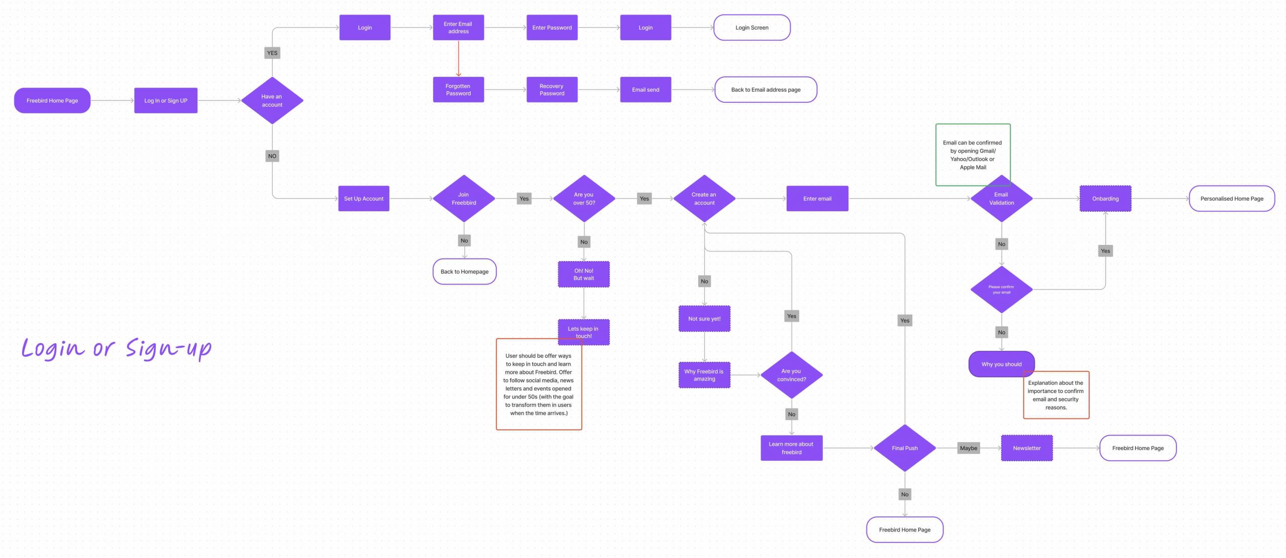
Our onboarding flowchart outlines clear decision points, age verification for our target demographic, and interactive steps for those undecided about joining. To maintain contact with non-members, we offer informational newsletters, ensuring a personalised, informed path to membership
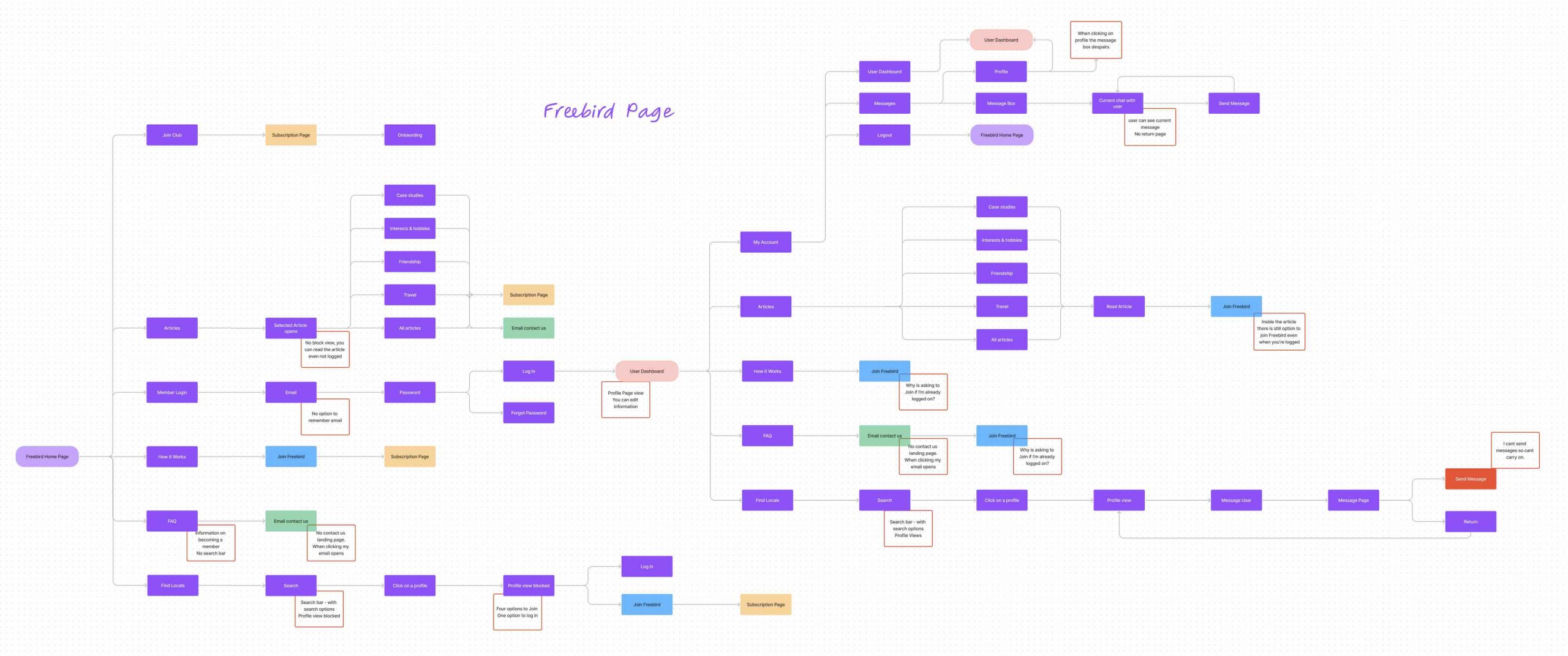
The flowchart displays the ‘Freebird Page’ user navigation, highlighting action points and potential UX challenges. It reveals critical user interactions with the platform’s diverse features and identifies potential confusion points to ensure a frictionless experience
We meticulously honed the homepage and onboarding through our critical usability testing phase. Iteration was key – merging user feedback with Hotjar analytics to refine functionality and enhance user experience.
30
Participants engaged through live Zoom sessions coupled with insights from Hotjar for in-depth user experience analysis.
2
A dual-phase approach evaluated initial interactions and the seamless flow from onboarding to homepage redesign.
Insightful Methods
Our approach combined direct observation with analytics to inform a strategic, insight-driven redesign.
Navigational Clarity
User insights underscored the need for intuitive navigation, guiding our design refinements
Analytical Insights
Hotjar’s metrics proved a comprehensive view of user engagement and intuitive design elements.
Iterative Collaboration
Our design philosophy emphasises integrating user feedback for continuous refinement and enhancement.
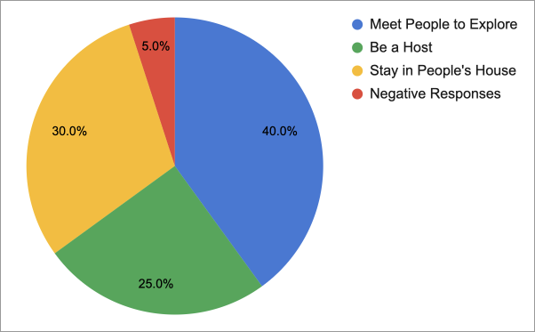
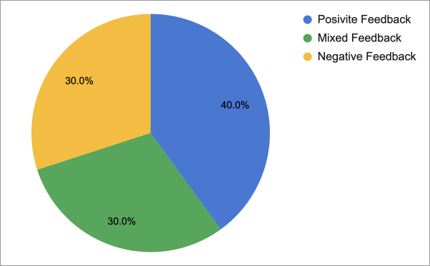
Interests:
The pie chart analysis indicates a balanced mix of feedback, suggesting room for improvement, particularly in addressing women’s safety concerns for better community engagement and implementing robust safety protocols.
Safety-Conscious:
The pie chart highlights equal positive, negative, and mixed feedback levels, suggesting nuanced perceptions about user safety, particularly among women. Enhanced security features could improve trust and increase positive user experiences.
ideation & design
Design Principles
Freebird’s brand guidelines distil our essence into a cohesive visual and verbal narrative. They’re not just rules but a roadmap for consistency and resonance, giving Freebird a distinct voice and image in a crowded market.
The guidelines define a colour palette that speaks to Freebird’s mature audience, embodying trust and community. Coupled with a tone that balances friendliness with clarity, it ensures Freebird communicates with warmth and purpose.
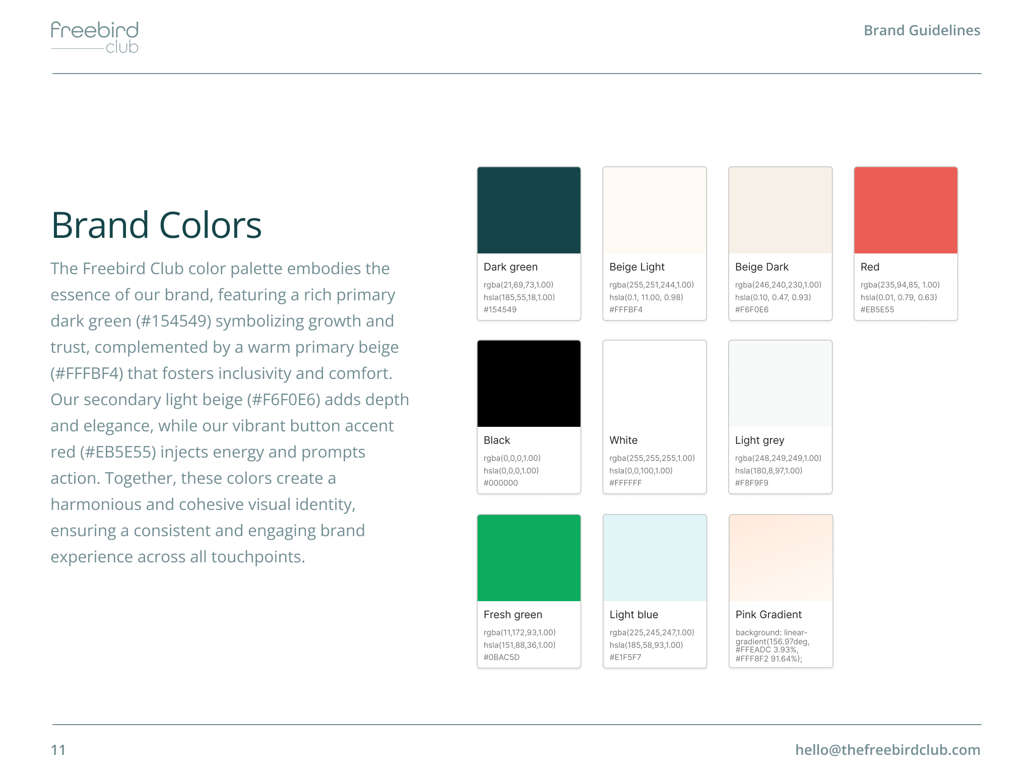
Part of Freebird’s detailed brand guidelines.
Our typefaces are carefully selected for legibility, complementing the visual narrative of journey and connection. The imagery guidelines underscore this narrative, capturing the essence of Freebird’s adventurous spirit.

Part of Freebird’s detailed brand guidelines.
The logo’s usage is meticulously defined to preserve its integrity across varied applications. This consistency fosters recognition and reinforces trust, which is integral to the brand’s presence.
Part of Freebird’s detailed brand guidelines.
Unveiling the Path to Innovation
At the heart of our project lay a commitment to deeply understanding the needs of the Freebird Club’s senior audience and conceptualising solutions that enhance their experience. Leveraging the insights gained from our preliminary research, we embarked on an ideation journey characterised by creativity, collaboration, and user-centric thinking.
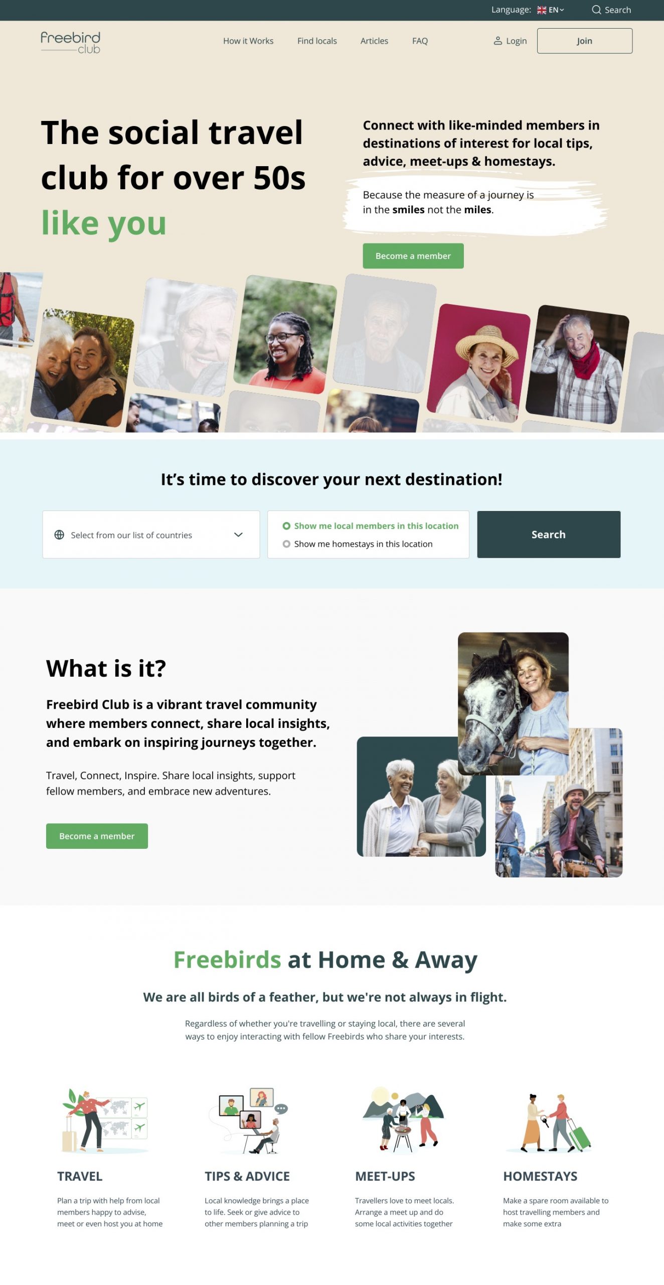
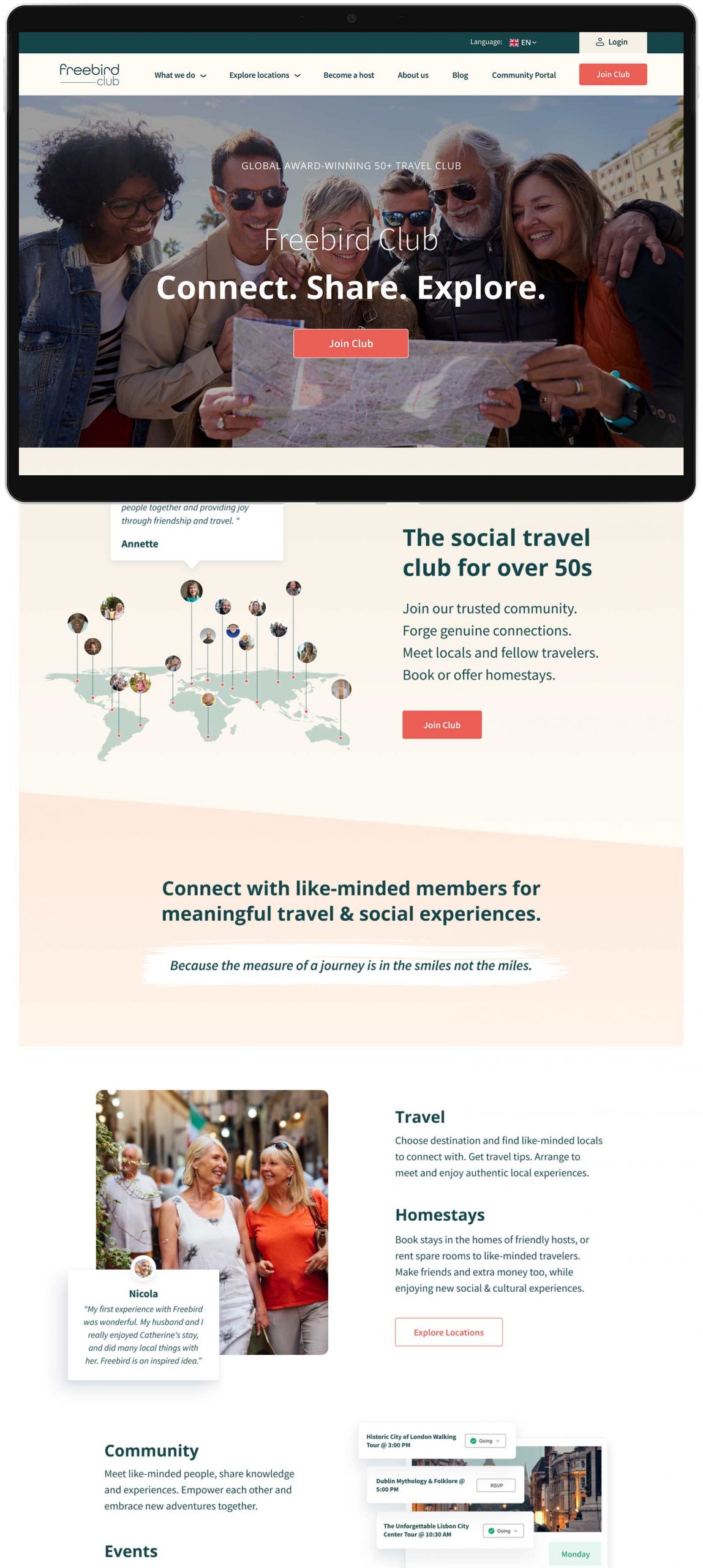
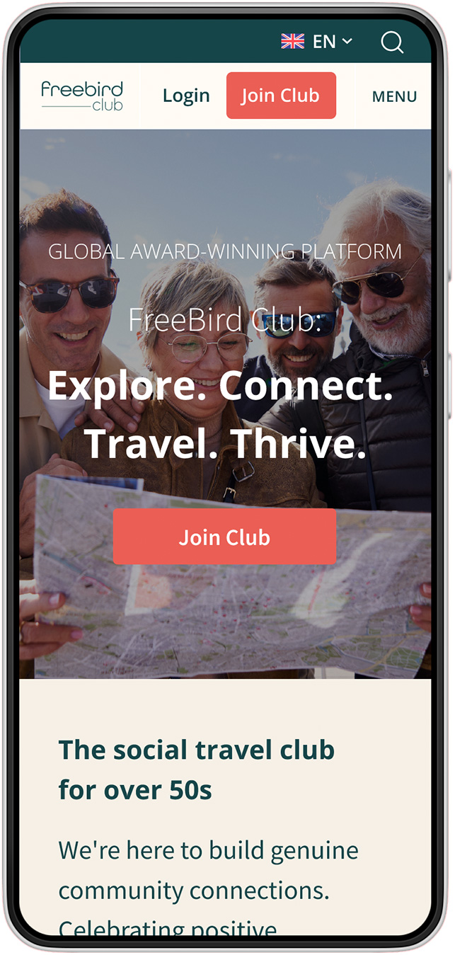
Explore Freebird’s digital presence’s transformation journey. Slide to unveil the nuanced refinements from the original layout to the current, user-centric design.
Displayed imagery showcases a segment of the full website redesign.
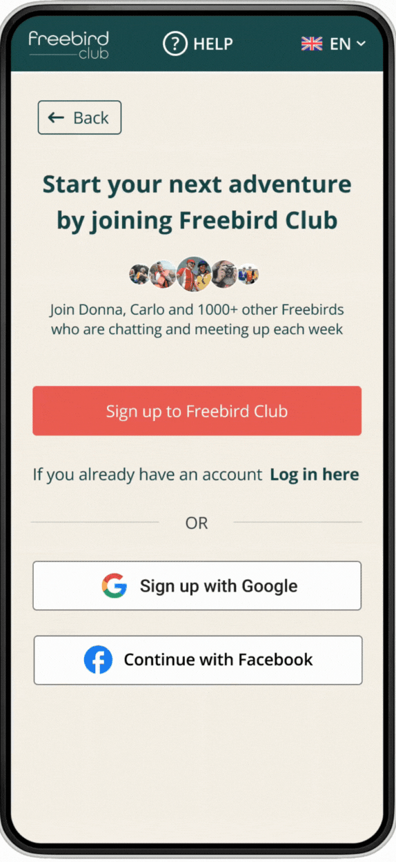
Our wireframes guide older adults through an intuitive sign-up, prioritizing ease and trust to connect them with the community.
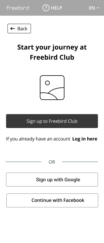


Each redesign of the mobile menu brings a sharper distinction between joining and logging in, affirming the platform’s global reach with persistent language options. The evolutionary design moves toward an interface that intuitively caters to a diverse user base, streamlining the entry experience.
Original: This showcased a hamburger menu with a ‘Join’ CTA, emphasizing user onboarding and a global audience with a language selector.
1st Phase: Transitioned to a ‘Join us’ button for a more inclusive feel and integrated search, highlighting functionality and community engagement.
2nd Phase: Segregated ‘Login’ and ‘Join’ buttons for clear user direction, maintaining a consistent search feature for ease of use.
Improved: Consolidated ‘Login’ within the menu and featured ‘Join Club’ as the main action, reducing clutter and enhancing the sign-up journey.
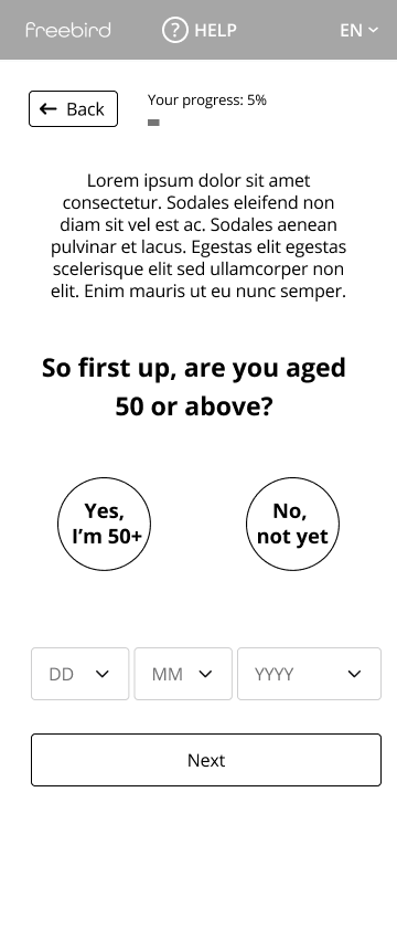
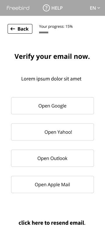
Our onboarding is crafted with the 50+ community in mind, initiating with an age verification step. For visitors not yet 50, we offer a warm invitation to stay connected through our newsletter or a reminder service, ensuring they can join the Freebird experience when eligible.
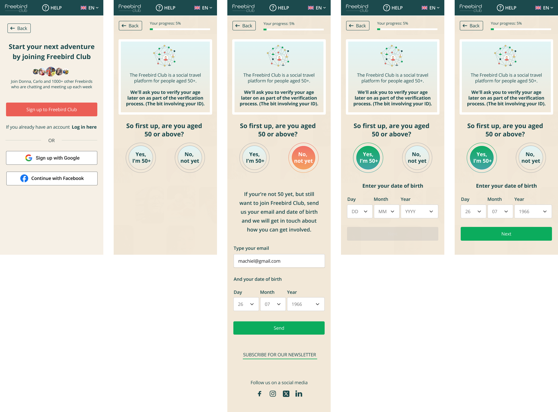
Quick preview of the beginning of the onboarding process – high fidelity.
prototype
Bringing the Solution to Life
With a solid understanding of the Freebird site and user needs, we focused on translating insights into practical, refined designs. By methodically iterating each feature, we ensured that every enhancement integrated seamlessly into the platform, meeting and exceeding user expectations and boosting usability and overall engagement.

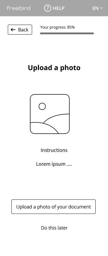
Mobile Onboarding:
This preview highlights the first phase of our mobile onboarding, focusing on age verification for users 50 and older. Users below the age limit can opt to join our newsletter and receive future updates when eligible.

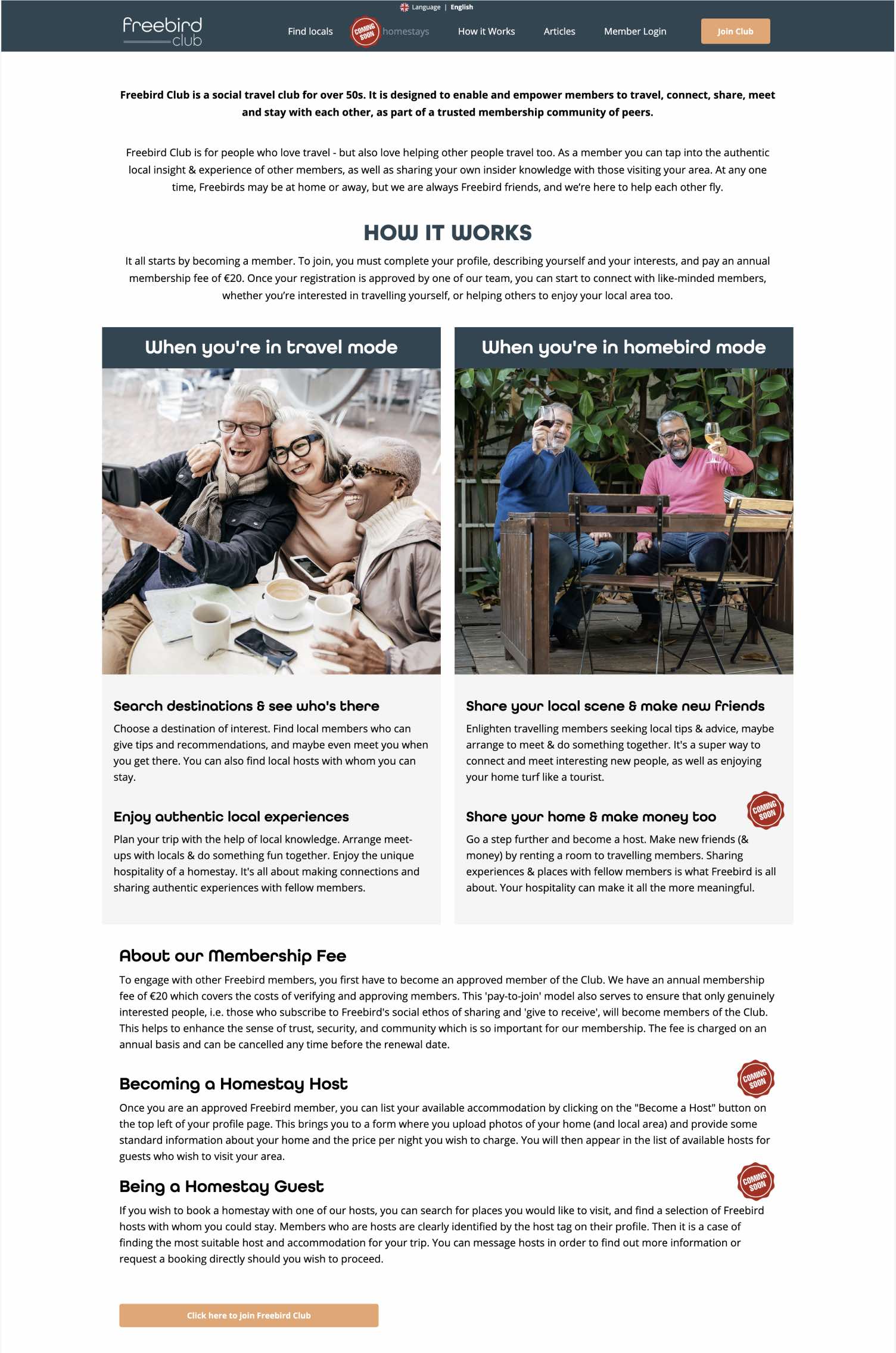
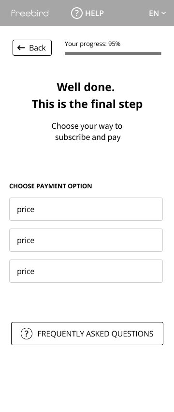
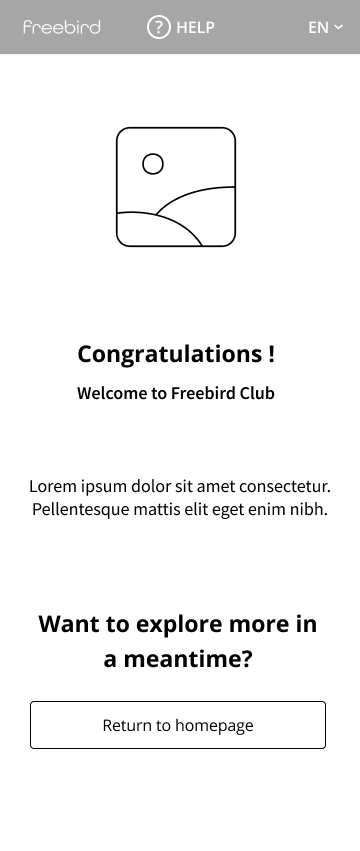
Website Flow:
Explore the streamlined website flow. This brief showcase highlights the integration of the new homestay feature and our visual revamp in line with brand guidelines. For an extended tour or hands-on experience, check the options below.
impact & insights
Freebird's Voyage: From Insights to Outcomes
This section highlights the tangible outcomes of our redesign, which significantly boosted user engagement and satisfaction at Freebird while fostering a more accessible and inviting platform for seniors. Our close collaboration with developers ensured a seamless transition from design to implementation, maintaining design integrity.
User Engagement Surge
User engagement increased to 88.5%, significantly from 50-60% metrics earlier.
User Satisfaction
Users praised the new, intuitive navigation and seamless experience.
Membership Increase
Membership growth spiked by 30% immediately post-launch, signalling strong user adoption.
Reduced Bounce Rate
The bounce rate was reduced by 20%, showing higher content retention.
Page Load
Streamlined access with faster load times, enhancing user navigation and satisfaction.
Increased Daily Active
Daily interactions are up by 25%, reflecting enhanced user involvement.
As we look forward, we focus on leveraging insights gained to continue enhancing the digital experience for older adults. Prioritising accessible design, we aim to integrate advanced technologies and deepen our understanding of user needs to foster inclusivity and engagement.
Enhance AI Features: Experiment with AI to personalise and improve user interactions.
Deepen Accessibility Research: Conduct extensive research to uncover more profound insights into accessibility needs.
Prototype Innovative Features: Develop and test new features that address user feedback and improve overall usability.
Reflecting on this project, I’ve gathered crucial insights shaping my design and user engagement approach. These learnings reinforce the importance of empathy and continuous adaptation in creating solutions that resonate with users.
Empathy Drives Design: Recognizing the profound impact of empathetic design on user satisfaction.
Iterative Approach: Validating the effectiveness of iterative design and feedback for continual improvement.
Focus on Accessibility: Learning the significant role accessibility plays in enhancing user interaction and retention.
Community Engagement: Understanding the value of building a supportive and engaging community environment.